Lesson 102: DSLR Macro Photography

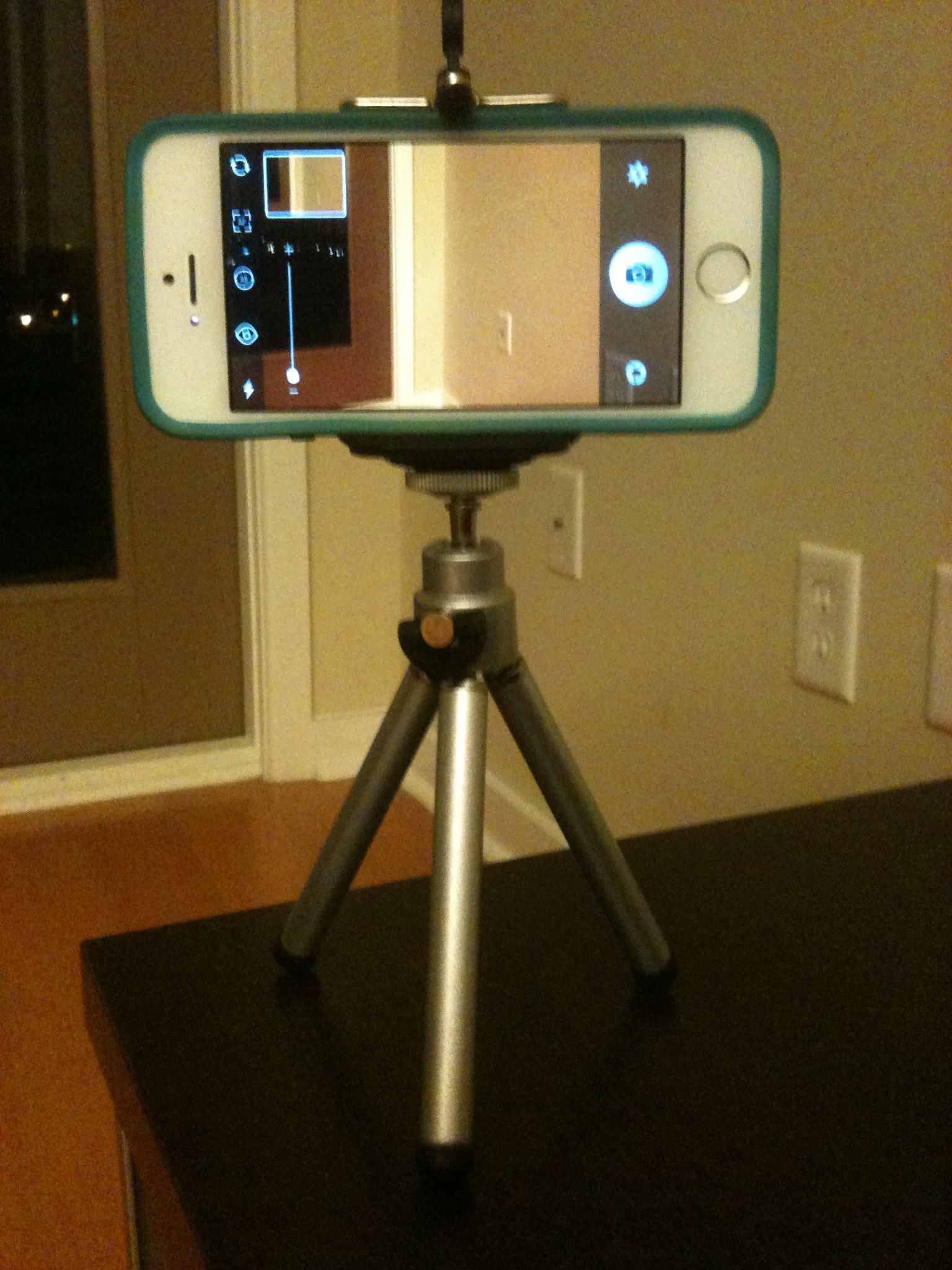
Since I answered a question about macro photography with the iPhone on our Facebook page yesterday, thought I’d do a more detailed follow up on macro with a DSLR version–my apologies for using the iPhoneography blog for a DSLR example.  For the iPhone version, check out Lesson 37:  Small Subjects.

Macro (in Canon terminology; micro if you’re a Nikon shooter) photography is probably best understood as getting really close-up to small subjects.  So close that the subject is life-sized or larger on your camera’s sensor.  It allows us to capture details that are often surprising to those of us who can’t see that well without our reading glasses.

The challenge is that all lenses have something called a minimum focusing distance.  Macro (or micro) lenses have short enough minimum focusing distances to allow you to get up close and personal with a 1:1 ratio, meaning if the subject is 10mm wide, it occupies 10mm on your sensor.

If you don’t have a macro lens, you can use extension tubes to make your minimum focusing distance much smaller, allowing you to get much closer.  Extension tubes can also be used with a macro lens to get larger than a 1:1 ratio.  Extension tube sets run from about $20-200 with the low-end being full manual and the high-end supporting the lens electronics.  With the low end version, you are likely to be stuck with a wide open aperture as the camera and lens won’t be talking to each other.

Since this blog is normally used to post simple lessons on photography you can do with your iPhone, I’m going to try to minimize the tech talk here.  But, depth of field is important in macro photography.  Depth of field refers to how much of the image is acceptably sharp in the 3rd dimension of your image–that is, front to back of the scene.

Getting up close to a subject means your depth of field is minimal even with the aperture stopped all the way down.  Sometimes backing up a bit and going more for a “close-up” shot vs a true macro image yields a more pleasing image as a result.  I frequently use a very small aperture opening (f/22ish) and opt to go “close-up” rather than true macro to increase depth of field.

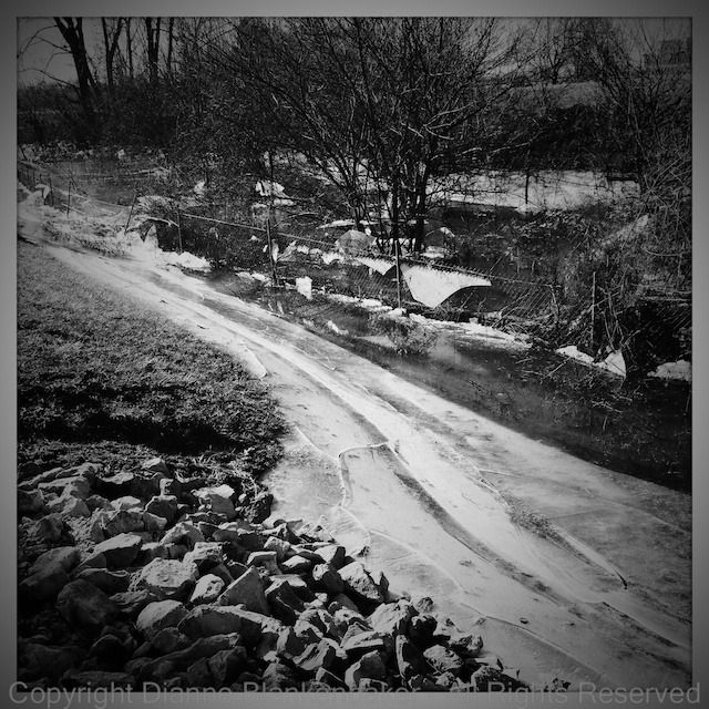
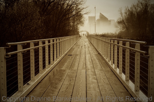
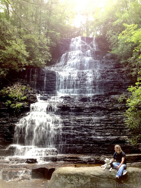
Your Assignment:  I’ve included some examples of my own experiments.  There are many better examples out there from serious macro photographers.  Google macro photography in Google images and see what you get–it’s like a whole new universe living right under our lenses.  Check it out and see if this is a form of photography you’d like to experiment with.  If so, for iPhone shooters, consider getting a macro attachment lens (see Lesson 37).  For DSLR shooters, check out extension tubes as a cheap way to turn a lens you already have into a macro lens.  If you have an advanced point-and-shoot, you may also want to check out whether a macro attachment is available for your camera.


iPhoneography Lesson 101: Slow Shutter App and a Highway Bridge

I introduced the Slow Shutter app several posts ago, but this time, I dug out my iPhone tripod and found a view of a highway bridge over a river so I could demonstrate this app creating light trails.

3GSphoto of 5S

First and foremost, this requires a tripod.  Here is a shot taken with an iPhone 3GS of my iPhone 5S in its nice little tripod courtesy of Photojojo (they have crazy accessories for iPhoneography that will make you feel like you’re buying Barbie photography gear).  The one I have came with a telephoto attachment and works fine on flat surfaces, but if I had no interest in the telephoto attachment, I would go for the $15 Gorillapod.  Just something to keep in mind for the post-Christmas shopping frenzy.  🙂

If you decide to buy something, Photojojo is offering $5 off to both you (if it’s your first-time order) and me if you use this link to go to the website:  http://photojojo.com/r/afvu–a win-win deal!

To create the Slow Shutter images, I used an 8 sec exposure under the light trails settings.  Below, find the two steps required to set this up plus what to do after you shoot:

Once you get your camera set up and going, you can keep adding to the exposure.  In this example, I did a series of 4, 8-second exposures over top of each other before saving the final image.  The key is not to move the iPhone at all when you do this.  Any vibration from tapping the phone or in the tripod it’s sitting on shows up in the image.  The problem I experienced was that I couldn’t tap the screen firmly enough without moving it to get the camera to focus on the subject, leaving me with soft focus on the distant bridge.  Here are two images on the tripod, both with soft focus:

All-in-all, I’d have to say that Slow shutter is a great idea, but probably not a useful app if you just want to pull the camera out of your pocket and start shooting.  In case you’re curious what it would do if you just hand held the iPhone, here’s the best I could do hand-holding:

Your Assignment:  Do you have an interest in being able to capture light trails at night?  Is it worth it to you to have a tripod for your iPhone to capture such images?  If so, Slow Shutter is a great app to experiment with.  We’ll also take a look at using Slow Shutter with panning in future lessons.  In the meantime, give it a try with cars driving by and see if you can get the results you’re seeking.


iPhoneography Lesson 100: Hipstamatic on Ice with iPhoto on the Side

One of the great things about the iPhone as a camera is that it is virtually always with you.  Being able to pull out an iPhone versus missing a shot is a great option.  The only downside, for those of us who have invested heavily in prosumer DSLR equipment, sometimes we find ourselves opting for the more convenient iPhone, even when we could pull out the big guns with a little extra effort.

For example, today, I was wandering around a parking lot in a cold wind somewhere in Indiana or Kentucky, allowing my dog to stretch his legs after several hours of riding in the car.  A small drainage ditch ran around the parking lot, which bordered a farmer’s field.  It appeared the water had dropped several feet after freezing, leaving sheets of ice hanging from trees and fencing along the drainage ditch.

The bright afternoon sun glared off the ice, giving the whole scene less than ideal lighting, but interesting glare.  So, what did I do?  Did I return to my car, dig my camera bag out from its hiding place, unzip all the zippers required to get out my camera and a lens and then dig up my tripod and go back and shoot in the sub-freezing temperatures?  Well, I thought about it for a moment.  Then, I reached into my pocket, pulled out my iPhone, opened up the Hipstamatic app and grabbed as many shots as I found interesting.

Yes.  Sometimes I choose to be lazy.  Sometimes I choose to save time.  Sometimes I choose both.

To further complicate things, I didn’t have my glasses.  When I opened up Hipstamatic, I thought it was on the BlacKeys ultrachrome film.  It was actually Blanko film.  Blanko film is color film and I really wanted black and white.  So, it was iPhoto iOS to the rescue.  I did a quick auto-enhance + black and white effect to get the black and white look I’d envisioned.  These steps are covered in detail in Lesson 96 (I did not use the Sepia button in today’s examples, but otherwise the steps are the same).

Your Assignment:  Check out these earlier lessons on lighting:  Lessons 16, 17, and 67.  Sometimes, bright afternoon light can add interest to an image even though we normally think of it as being too harsh and creating strong shadows and contrasty images.  In the winter months in particular, the sun is lower to the South and the angle of the light gives it a very different look from a straight overhead sun in the summer.  Can you tell that the sun in these images is very bright?  Does the black and white version look more or less appealing to you?

iPhoneography Lesson 99: Christmas Eve and the iPhone

Just a quick tip that Christmas trees work well with Hipstamatic as well as more traditional camera apps.  Also try including reflections of the lights in the windows in the frame if you want something a little different from the traditional Christmas tree.

Have a wonderful day tomorrow whether you celebrate Christmas or not.  Peace on earth, goodwill to all, and good night!

iPhoneography Lesson 98: Comparison of Apps at Night


Having just passed the shortest day of the year in the Northern hemisphere, I thought it was a good time to look at how different apps perform at night on the iPhone 5S.  I’m sure you all heard that the 5S was a step up for low-light photography with it’s bigger aperture and larger, less noisy sensor.  If you don’t know what any of that means, that’s OK, it’s just supposed to be better than predecessors at night.

As someone who shoots a lot with a DSLR that does fantastic things at night, it’s a little hard for me to judge fairly about whether the improvement is significant between my 4S and 5S, but I was curious to see if using different apps on the iPhone while hand holding made any difference at all in the quality of the images in low light.

The answer is pretty much “no” for the apps I tried in this comparison:  the Apple Camera App, Hipstamatic, Camera Awesome, and Pro HDR.  Here are the things that differ, both good and bad, over the Apple Camera App:

Hipstamatic

The cool (or should I say hip?) thing about Hipstamatic at night is that the filters it applies to the image make the noise of low-light photos look intentional.  They seem like part of the artistic effect instead of an annoying accident.

The downside is that you only get square images, which I don’t particularly like for a scene that is wide and short like the Chattanooga riverfront.

Past Hipstamatic Lessons:  Lesson 13:  Getting Hip; Lesson 24:  Using Hipstamatic to Include and Exclude; Lesson 26:  The iPhone and Wildlife; Lesson 29:  Hipsta-Classic; Lesson 30:  Awesomely Hip Portraits; Lesson 43:  Patterns; Lesson 46:  Flower Power; Lesson 88:  Hip Heads; Lesson 93:  Old Places, New Dressing.

Camera Awesome

The level–it’s particularly useful at night when it’s too dark to judge visually if you’ve got a tilt going on or not.

Being able to separate the focus point from the exposure point gives you more control over whether you get a lighter or darker exposure (I did not use this feature in the examples, but you can see how to use it here).

Past Camera Awesome Lessons:  Lesson 7:  Keep It Level; Lesson 8:  Separating Focus from Exposure; Lesson 12:  Awesomization; Lesson 14:  Another Way to Be Hip; Lesson 31:  Blur and Flash; Lesson 34:  When You’ve Got the Shakes; Lesson 43:  Patterns.

HDR Pro

Combining two images helps get better exposure, but the inherent problem of hand-holding at night is that the shutter is pretty slow, meaning more shake shows in the image.  When you add a second image to that, the focus looks extra soft.  We’ll try it on a tripod in another lesson to see how much that helps.

Past HDR Pro Lessons:  Lesson 9:  Combining Two Exposures into One Photo; Lesson 18:  When the Light is Out of ControlLesson 20:  Using Filters in Pro HDR; Lesson 21:  Filters and Photos in Your Library; Lesson 36:  Creating Space.

Your Assignment:  Pick an app.  Any app.  Go out in the dark, find an area with night lights, and experiment for yourself.  Does Hipstamatic make the noise tolerable?  Does Pro HDR solve much of the problem or make it worse?  Are you able to hand-hold and still get a sharp image?  Does the level on Camera Awesome (several other camera apps include a level) help you as much as it helps me?  How much does separating the exposure from the focus point help?

Lesson 96: iPhoto Mobile and Sepia

iPhoto Mobile has become my favorite photo editing app on the iPhone.  I haven’t used them all, but it’s quick and easy and the editing capabilities are pretty impressive for a mobile app.  Plus, it’s free.  I first introduced iPhoto in Lesson 83 Metadata and also used it in Lessons 84 iPhone Mobile Editing, 85 iPhoto Con Tours, 86 My Silly Dog and the iPhoto Exposure Tool,  and 87 Adding Drama in iPhoto iOS.

Today, I am going to show you how to take a color photo and turn it into a more nostalgic looking black and white with sepia.  I am not frequently a fan of sepia, but this image called out for sepia to me.  There is something about the rustic looking wood planks in the bridge leading to the couple headed into the fog against the very modern looking building in the background that made me think “sepia.”

I originally took this image with my DSLR, but because it was in my Photo Stream, it was easy to open it from the iPhone without having to do anything fancy to get it there.

I love Photo Stream when it works.  Sometimes, however, images don’t show up when and where I expect them to, which can be annoying.  Most of the time, I happily discover all of my recent images on all of my devices just as advertised.

One of the things I wanted to accomplish with the adjustment was to make the couple in the background walking into the fog stand out more.  While the bridge and path lead the eye to the couple, in the original version, they were competing with the colors in the trees and the background building for attention.  By changing the image to B&W and using a vignette to darken all of the outer objects in the frame, the people in the background pop out more.

To my eye, adding the sepia coloring made the effect even stronger by causing the bridge and path to look brighter compared to the trees, leading the eye more directly to the couple in the distance.

Here are the step-by-step instructions for the adjustments I made in the iOS version of iPhoto on my iPhone 5S:

Your Assignment:  Sometimes sepia will perk up an image that otherwise seems rather dull.  This, like all artistic choices, is subjective.  If you don’t like it, that’s OK–knowing what you don’t like is a great step towards learning what you do like.  But give it a try in any case–you can always delete it.  Choose an image where the colors are not a key component in the impact of the image and there is enough contrast in the image that the subject will still stand out without color.  I find sepia to usually be more appealing when there are architectural features in the image, but I have also used it with owls and vultures and liked it.  How do you feel about sepia?

Lesson 95: A Change of Perspective


How many times have you seen or taken a picture of a dog that looks a lot like this?  (You could probably replace the word “dog” with “child” here as well.)

02 Tisen grateful for Jack

Now, I don’t mean that all dogs (or children) look alike.  Rather, I mean that our default way of looking at a dog is from a standing position looking down at them.  Most dog photos dog owners snap are taken very quickly, spur of the moment without time to think or plan how we want to shoot.

This is usually because each of our dogs is the cutest, most brilliant canine kid in the world and we want to capture that hilarious thing he or she is doing that makes him or her that much cuter.

However, sometimes changing the perspective just a little can make a big difference  For example, compare these two photos:

In the first one, we have a funny expression that still cracks me up every time I look at it, but notice that the camera is above the dog’s head shooting down and the angle of his head to the camera makes it look considerably skinnier than it does in the photo on the right.  The one on the right was taken about level with the dog’s face, straight on to the nose.  If these were the only two pictures you’d ever seen of my dog, would you still feel certain these were both of the same dog?

Let’s compare a couple more:

Notice how in the image on the left, we have a cute snapshot of a dog rolling in the grass.  The camera is held almost parallel to the dog, leaving us no sense of the height of his body relative to the ground (except perhaps because of the stray foot that snuck into the shot).  But look at the leash that starts at the lower left corner and creates a line down to the dog.  It looks like it could be 10 feet long!  (It’s only 4 ft.)

Now look at the length of my dog’s front legs.  The are folded and parallel to the camera.  Compare that to the front leg in the photo on the right.  Notice how the leg now forms a similar angle to the lens that draws the eye back to the dog.  But this time, it’s his leg that looks exceptionally long.

Next, let’s look at wide angle perspectives that create a sense of size.

In the photo on the left, you could argue that the dog (and man) look really small, or, if you imagine the dog and man to be average sized, you might see this more as the waterfall looking really big.  On the right, we have an example shot tighter, but again, it’s wide, the camera is further back, and it’s shot from a standing position angled downward.  This creates the impression that the bench, man, and dog are all a little shorter than they really are.

Finally, here’s a perspective that creates a little bit of an optical illusion:

Both images were shot from the floor looking up at my dog hanging over the edge of a sofa.  In the photo on the left, the back legs are not visually connected to the front end of the dog.  They visually look like either there is a second dog in the photo or the visible dog was cut in half with his back legs moved to the side.  I can assure you that no animals were harmed in any way in the making of this post.

In the photo on the right, I got up tight to my dog’s back paws and created more of a silhouette effect.  By changing the perspective so that I am both closer and looking up, the paws look huge!  Notice that the one on the right looks significantly bigger than the one on the left.  This is because it was closer to the camera and it’s turned at a slightly different angle that makes the full breadth of the pad visible, but angled to the camera.

Your Assignment:  Experiment with the visual effects you can create by changing where you’re angle to the subject.  Move up, move down, move all around.  Try shooting from above and shooting from down low.  Try head on, too.  None of these angels are right or wrong; they just create a different perspective that affects the way the eye perceives the shape of the subject.  Bonus Tip:  want to look taller and thinner?  Have the iPhotographer get down low and shoot at an upward angle.

Lesson 94: Choices, Choices

Let’s say you happen to be walking along a scenic riverfront at sunset.  There are interesting architectural features on the South side of the river and the sun, not having recently changed it’s course, is setting off to the West.  There are just enough clouds along the horizon to make for a decent sunset, but the sky above the horizon is clear, without much interesting going on.

You think, “Oh, what a nice sunset reflecting on the river,” and you pull out your iPhone.  But you quickly discover that taking a picture of the sunset doesn’t include the interesting buildings and taking a picture of the buildings misses the best part of the sunset.  To boot, the buildings are too dark.  What do you do?

Well, this is the joy of photography:  sometimes you have to choose.  You can’t always get what you want . . . so what do you need?

And that is the other joy of photography–you get to decide.

I’ve shared 6 of the images I took in the gallery above, each with the scene framed differently.  Below, I’ve taken these 6 images and pointed out the things that bug me about them.  There are many.  However, I think it’s useful to learn what other people look at and what bugs them in photographs when you’re trying to figure out what makes one photograph more appealing than another.  Remember, there are no rules, but part of photography is learning to see things differently.  Sometimes that includes your own photos.


Your Assignment:  Take a look at the comments I’ve made on my photos below.  I’ve color-coded them for things I think are positives (green), things that are less-than-ideal but tolerable (yellow), and things that are a deal-breaker for me (red).

20131219 Choices Choices.001

20131219 Choices Choices.002

Do you agree with my assessment?  Do you see other things that bother you (there are many more things that bother me than I included in the comments)?  Do you like things I don’t?  Did you notice the things I pointed out before you read my comments?

Why do you think two people look at the same photo and see it differently?

Lesson 93: Old Places, New Dressing

Now that winter is upon us (well, some of us more than others) in the northern hemisphere, even the tired old subjects we see everyday take on a whole new look.  One of the fascinating things about photography is that everyday is a new day.  Every minute is changing light.  You can always find a new way to see the same thing you looked at last season, last night, the last minute.  This change is particularly dramatic as the seasons change.

So, in today’s lesson, I invite you to revisit a common, convenient location like your own yard.  Put on an extra layer or two if it’s especially cold in your neck of the woods, but by all means, get outside.  Even if you don’t have snow where you live.

Go out early–when the temperatures drop to freezing overnight and you get out before the sun has had a chance to warm things back up, frost can be a spectacular subject.

In fact, even when the frost isn’t that dramatic, like in these images, it still creates a different look by brightening what can otherwise be dull looking plants when there’s no frost.

On the particular morning I pulled out my iPhone to capture some frosty spots in my neighborhood park, the sun was low, shadows were long, and colors were drab.  After taking a few images with the Apple camera app, I decided to use the Hipstamatic app with the D-Type film for the tintype effect.

I like how the frost-covered plants look in the tintype effect–they jump out more with their frosty coating.  The Apple Camera app works, too.

 Your Assignment:  Pick a place that might feel a little tired as a photographic subject.  Your yard might be one such place.  A place you walk regularly might be another.  Make sure your iPhone is fully charged and then head out at sunrise (which isn’t so early these days) to look anew at what you’ve seen a hundred times before.  Look at the shadows and light.  Look for frost bouncing back the rising sun.  Look for new angles and new ways of seeing the same old thing.  Try the Apple Camera app.  Try the Hipstamtic app.  See if you can make something old look brand new.

Lesson 92: Heavenly Bodies


Every once in a while, I take my dog out after dark (which happens a lot more often this time of year), look up, and am inspired to take some photos.  To be honest, the amount of noise in the iPhone night photos continues to frustrate me, even with the iPhone 5S.

But, recently, I was teaching a workshop and I asked if anyone had seen a creative use of noise (all the grainy speckles) in photography and a couple of folks commented that it could be used to create an antique effect.  I’m not sure I’ll ever get to where I make noise a goal, but it does open up some possibilities.

So, tonight, I looked up and saw Venus chasing the moon.  I immediately pulled out my iPhone and gave it a shot.  The images in the gallery were edited using the free, iOS version of iPhoto on my iPhone (see Lessons 84, 85, 86, and 87).  As you can see, they are noisy, but Venus and the moon are worth some noise.

Although the crescent moon turns into a blob, I’m pleased that Venus shows up in most of the images.

Your Assignment:  Don’t be afraid to go for broke on night images just because you’re using an iPhone.  Don’t let any Nokia Lumia-owning friends intimidate you!  However, as you may recall from Lesson 3, zooming on the iPhone is a digital zoom, which will make the noise factor that much bigger.  Instead of trying to zoom in to get a close-up of heavenly bodies at night, try artistically placing landscape features in the scene, giving the sky some perspective.