iPhoneography Lesson 101: Slow Shutter App and a Highway Bridge

I introduced the Slow Shutter app several posts ago, but this time, I dug out my iPhone tripod and found a view of a highway bridge over a river so I could demonstrate this app creating light trails.

3GSphoto of 5S

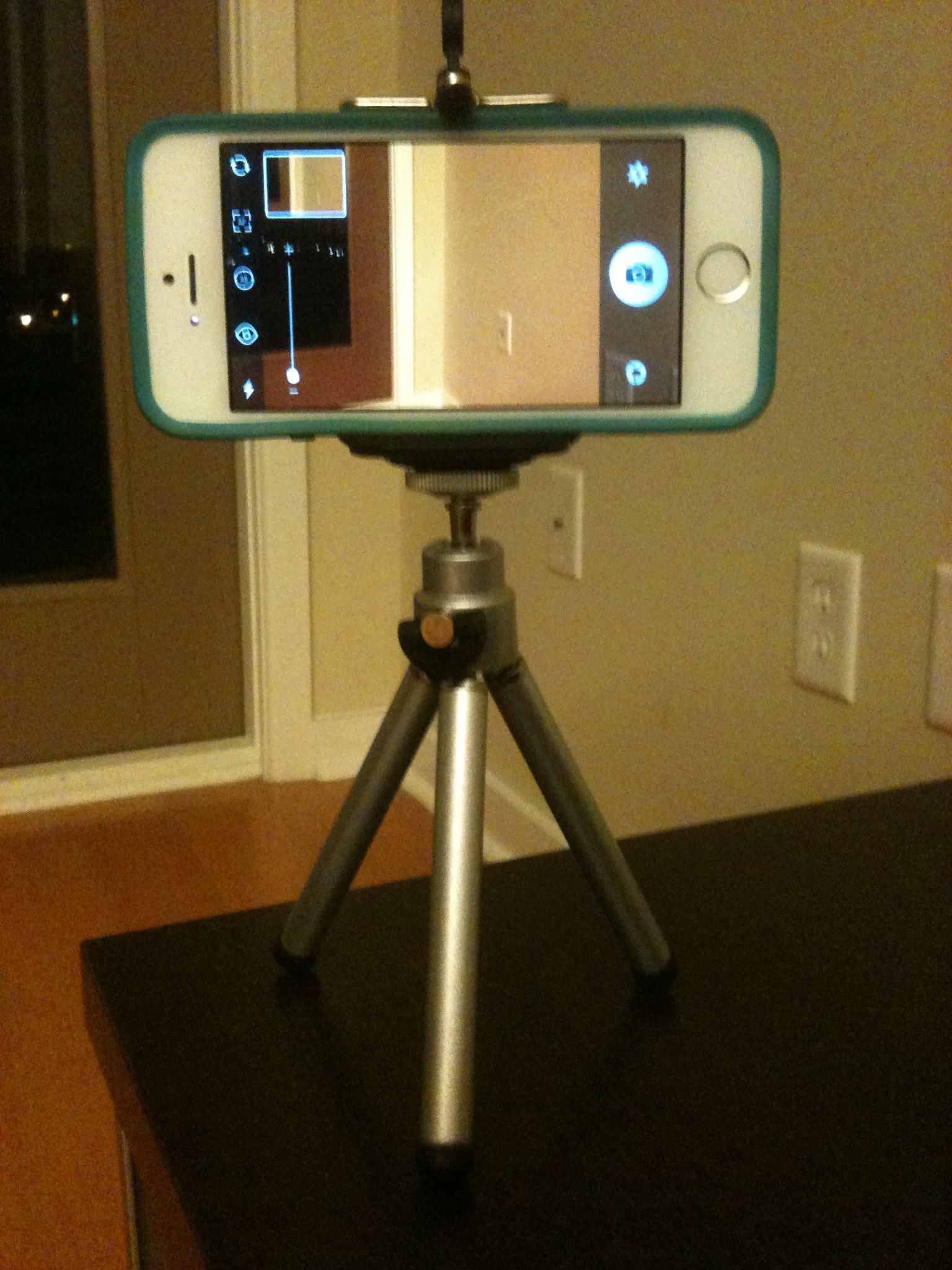
First and foremost, this requires a tripod.  Here is a shot taken with an iPhone 3GS of my iPhone 5S in its nice little tripod courtesy of Photojojo (they have crazy accessories for iPhoneography that will make you feel like you’re buying Barbie photography gear).  The one I have came with a telephoto attachment and works fine on flat surfaces, but if I had no interest in the telephoto attachment, I would go for the $15 Gorillapod.  Just something to keep in mind for the post-Christmas shopping frenzy.  🙂

If you decide to buy something, Photojojo is offering $5 off to both you (if it’s your first-time order) and me if you use this link to go to the website:  http://photojojo.com/r/afvu–a win-win deal!

To create the Slow Shutter images, I used an 8 sec exposure under the light trails settings.  Below, find the two steps required to set this up plus what to do after you shoot:

Once you get your camera set up and going, you can keep adding to the exposure.  In this example, I did a series of 4, 8-second exposures over top of each other before saving the final image.  The key is not to move the iPhone at all when you do this.  Any vibration from tapping the phone or in the tripod it’s sitting on shows up in the image.  The problem I experienced was that I couldn’t tap the screen firmly enough without moving it to get the camera to focus on the subject, leaving me with soft focus on the distant bridge.  Here are two images on the tripod, both with soft focus:

All-in-all, I’d have to say that Slow shutter is a great idea, but probably not a useful app if you just want to pull the camera out of your pocket and start shooting.  In case you’re curious what it would do if you just hand held the iPhone, here’s the best I could do hand-holding:

Your Assignment:  Do you have an interest in being able to capture light trails at night?  Is it worth it to you to have a tripod for your iPhone to capture such images?  If so, Slow Shutter is a great app to experiment with.  We’ll also take a look at using Slow Shutter with panning in future lessons.  In the meantime, give it a try with cars driving by and see if you can get the results you’re seeking.


iPhoneography Lesson 99: Christmas Eve and the iPhone

Just a quick tip that Christmas trees work well with Hipstamatic as well as more traditional camera apps.  Also try including reflections of the lights in the windows in the frame if you want something a little different from the traditional Christmas tree.

Have a wonderful day tomorrow whether you celebrate Christmas or not.  Peace on earth, goodwill to all, and good night!

Lesson 95: A Change of Perspective


How many times have you seen or taken a picture of a dog that looks a lot like this?  (You could probably replace the word “dog” with “child” here as well.)

02 Tisen grateful for Jack

Now, I don’t mean that all dogs (or children) look alike.  Rather, I mean that our default way of looking at a dog is from a standing position looking down at them.  Most dog photos dog owners snap are taken very quickly, spur of the moment without time to think or plan how we want to shoot.

This is usually because each of our dogs is the cutest, most brilliant canine kid in the world and we want to capture that hilarious thing he or she is doing that makes him or her that much cuter.

However, sometimes changing the perspective just a little can make a big difference  For example, compare these two photos:

In the first one, we have a funny expression that still cracks me up every time I look at it, but notice that the camera is above the dog’s head shooting down and the angle of his head to the camera makes it look considerably skinnier than it does in the photo on the right.  The one on the right was taken about level with the dog’s face, straight on to the nose.  If these were the only two pictures you’d ever seen of my dog, would you still feel certain these were both of the same dog?

Let’s compare a couple more:

Notice how in the image on the left, we have a cute snapshot of a dog rolling in the grass.  The camera is held almost parallel to the dog, leaving us no sense of the height of his body relative to the ground (except perhaps because of the stray foot that snuck into the shot).  But look at the leash that starts at the lower left corner and creates a line down to the dog.  It looks like it could be 10 feet long!  (It’s only 4 ft.)

Now look at the length of my dog’s front legs.  The are folded and parallel to the camera.  Compare that to the front leg in the photo on the right.  Notice how the leg now forms a similar angle to the lens that draws the eye back to the dog.  But this time, it’s his leg that looks exceptionally long.

Next, let’s look at wide angle perspectives that create a sense of size.

In the photo on the left, you could argue that the dog (and man) look really small, or, if you imagine the dog and man to be average sized, you might see this more as the waterfall looking really big.  On the right, we have an example shot tighter, but again, it’s wide, the camera is further back, and it’s shot from a standing position angled downward.  This creates the impression that the bench, man, and dog are all a little shorter than they really are.

Finally, here’s a perspective that creates a little bit of an optical illusion:

Both images were shot from the floor looking up at my dog hanging over the edge of a sofa.  In the photo on the left, the back legs are not visually connected to the front end of the dog.  They visually look like either there is a second dog in the photo or the visible dog was cut in half with his back legs moved to the side.  I can assure you that no animals were harmed in any way in the making of this post.

In the photo on the right, I got up tight to my dog’s back paws and created more of a silhouette effect.  By changing the perspective so that I am both closer and looking up, the paws look huge!  Notice that the one on the right looks significantly bigger than the one on the left.  This is because it was closer to the camera and it’s turned at a slightly different angle that makes the full breadth of the pad visible, but angled to the camera.

Your Assignment:  Experiment with the visual effects you can create by changing where you’re angle to the subject.  Move up, move down, move all around.  Try shooting from above and shooting from down low.  Try head on, too.  None of these angels are right or wrong; they just create a different perspective that affects the way the eye perceives the shape of the subject.  Bonus Tip:  want to look taller and thinner?  Have the iPhotographer get down low and shoot at an upward angle.

Lesson 89: Retromatic Wallpaper

Moving along to something just a bit too funky for me, but fun none-the-less.  Today, we’re going to take a look at the Retromatic app.  This app is designed to help you create really funky, retro creations.  They aren’t really photos anymore when you’re done, but they could make for fun cards, flyers, etc.

I decided to take an image I thought was cute but maybe not really a wall-hanger and see if I could make it wall-worthy by turning it into some silly wallpaper.  I can’t quite visualize what wall I would ever put this on, but I certainly had a good time playing with the capabilities of the Retromatic app.

The one challenge is highlighting just the parts of my subjects with my finger–this was especially tricky on my dog’s legs.  A stylus would probably make this much more accurate.


Your Assignment:  Try following these steps (an improvising) to create your own funky wallpaper:

Lesson 84: iPhoto Mobile Editing

Yesterday, I introduced you to metadata in the mobile version of iPhoto, a free app from Apple.  Today, I thought I’d show you a combination of using one of the brush editing tools and a filter to take my photo from not very interesting to a more retro look.  I particularly like how the light showing through the leaves in the foreground (left side) looks with the black-and-white effect.


Your Assignment:  Download iPhoto if you haven’t already.  Then open it up and select the photo you want to work on.  Here are the steps I followed for my edit:

Lesson 83: Metadata

Apple has  made iPhoto available for free on mobile devices.  It’s always been included with OS X devices (laptops, desktops).  Interestingly, it actually has more features on your mobile device for editing photos than the OS X version has, like brush tools.

But for today, I thought I would take the opportunity to show you something that you can now see on your mobile device.  In the past, you would have needed to download your photos to iPhoto or another photo organizer/editor on your computer to see what’s called the metadata.

Metadata literally means “data about data.”  It tells us things like when and where a photo was taken (and in iPhoto, even shows us on a map).  It also tells us some interesting facts about the settings the camera chose when you took the photo.

Now, I try not to get very technical in this blog, but I think it’s worth understanding something about what your iPhone camera is doing that the meta data in iPhoto can help you understand.

Let’s take a look at the metadata for this photo:

Notice the row of info right above the map?  It says “f/2.2 1/30 4.1mm — ISO 80.”  Since I promised Gina, the inspiration for this blog, that I wouldn’t get technical on her and here I am getting technical, I’m going to limit myself to talking about only one of these numbers:  1/30.  That’s how long the camera opened its shutter to allow light in to make the image.  1/30 of a second is a pretty long time for a shutter to be open–especially when it’s hard to hold an iPhone still.

But notice this photo was taken in a dimly lit room with very little light.  The iPhone had to keep the shutter open longer to get enough light in this setting.

Now let’s look at the metadata for a different image:

Notice that this one has a shutter speed of 1/800 of a second.  That’s a much faster shutter speed.  What’s different about this image?  Well, it was taken out doors in bright sunlight.  There was plenty of light to be had.

Slower shutter speeds will allow more motion to show in your photos.  Notice how my dog’s tail in the first image is blurred.  In the second image, the tree leaves are very sharp and show no motion even though there was a breeze blowing.

By looking at the metadata in iPhoto and checking what shutter speed the iPhone chose, you can get a good sense of what lighting will make it easier to show motion and what lighting will make it easier to get sharp images.

Your Assignment:  Download iPhoto if you haven’t already.  Open it up and tap the “i” button to check the metadata on a few images.  Compare indoor and daytime outdoor lighting–what shutter speeds do you see in images in each type of lighting?  Look for motion blur.  Can you find examples of slow shutter speeds leading to motion showing in your image?

Lesson 74: The Range of HDR

In yesterday’s post, I mentioned that some HDR processing takes the image to the point that it no longer looks like a photograph.  To give you an idea of the range of HDR-type processing possible, I did several different versions of HDR images using 5 photos taken with my DSLR at different exposures and combining them using Photomatix, a software tool used on a desk/laptop to combine exposures.

I realize this is cheating since this blog is about iPhonography and not about DSLR photography, but I thought it was worth the cheat just to give you an idea of the kinds of looks people may be thinking of when someone says “I don’t like HDR.”

Here is the range of looks I created for examples:

I do not have scientific data on how people respond to these different types of looks.  However, the anecdotal evidence I have is that people do not notice the HDR effect in the more subtle examples at the left; they just think it’s a “regular” photo.  As the photo moves from looking like a photograph to looking like a painting to looking like a painting gone horribly wrong, my experience has been that most people really like the painting look the first time they see it.  They like it the second time they see it.  They might even go a little nuts over it.  Then, at some point, they start to think it looks, well, to borrow a term from my husband, “kitschy.”

Of course, there are no rules, and I have seen this look applied artistically.

For example, I really like the work of a fellow blogger and iPhoneographer extraordinaire, Davide Capponi.  Davide does extraordinary things with iPhoneography by using multiple editing apps to create something that transcends photography.  Here is an example of one of his images that started with Pro HDR.  If you peruse Davide’s work, you will find that few of his images look like photos, yet I can’t imagine anyone calling them kitschy.

To me, the difference between “kitsch” and art is hard to define.  To a certain extent, when you see the exact same look produced over and over again by many different people, it starts to look kitschy.  When you see something that is truly unique, it stands alone.

Your Assignment:  Are you interested in just taking pleasing photographs with your iPhone, or does the thought of using it as a medium to create unique art excite you?  If you fall into the latter category, I suggest you spend some time looking at Davide’s work.  Davide records what apps he used for taking the photo and for editing.  You’ll notice he often uses a combination of 4+ apps to create his final image.  Do you find yourself inspired?

Lesson 71: 4S-5S Face-off at Sunrise

The iPhone 5S promises better photos.  It has a bigger opening in the lens for light to come through to allow for better low-light images.  It has a bigger sensor with larger pixels promising more light will reach each pixel and there will be less noise in your pictures.  What does all that mean?  We can see more details in the light and dark areas of photos, we can take better pictures in low-light conditions, and we can expect fewer annoying speckles in our photos.

Now for the test.  While out walking my dog this morning, I happened to be in time to see the sun rising over the Tennessee River just under a low-lying covering of clouds that were in the process of being swept away by the wind.  For once, I was packing both guns with my 4S in my left back pocket and my 5S in my right.

I literally took a point-and-shoot shot with each phone.  I used the default camera app with HDR off for this comparison–I didn’t even tap the screen to set focus or exposure.  I just help up each phone and shot.  Neither photo has had any post-processing done to it.  Drum roll please . . .

This is a a test of extremes.  The sun presents an extremely bright area while the water and bridges provide some very dark areas.  This is the kind of scene that challenges even the most sophisticated cameras.  Can you tell the difference between the way the 4S and the 5S each handle the subject?  Look closely at the sun.  Notice how the 4S version is a bigger blob with less detail in the clouds immediately around the sun.  Additionally, the big bridge support that’s nearly centered is slightly better exposed and shows more detail as well (this may be hard to see without magnifying the full-resolution photo).

Overall, the iPhone 5S also renders the golden light in the photo better–particularly where it is reflected on the water.

So, in short, I’m happy to see there is a visible difference between the two iPhones, but maybe that’s because I just bought the 5S and I’d really like to feel justified in making that decision.  If the difference is so minuscule to you that you can’t see a difference, well, hold the phone . . . we’ll take a look at more comparisons in other lighting conditions to see how the 5S fares.

Your Assignment:  No homework today!


Lesson 44: Fisheyes

This is our last lesson specifically on the Photojojo lens kit we started working our way through over several lessons (see Lessons 37, 38, and 39).  Today, we’re going to use my most favorite attachment, the Fisheye.

Fisheyes are not for everyone.  But in this case, we’re not talking about actual fish.  We’re talking about a lens attachment for your iPhone that causes the world to bend.  Who knew it could be so easy to bend things?

The fisheye attachment creates an effect of looking at the world like it’s in a snow globe.  Without the snow (well, unless it’s really snowing).  This effect can be overused pretty easily, but it sure is fun.  The fisheye effect is actually a super-wide lens that will put more of the scene in the photo than even the wide angle lens we looked at in Lesson 38.  As we noticed in Lesson 38, the scene was already starting to bend at the edges.  The fisheye takes that to an extreme.

Fisheyes in rooms can be especially fun–it’s often difficult to get an entire room into a normal photo.  The fisheye gives the effect of peering through a peep hole at an entire space all at once.  I also favor fisheye photos of my dog in various settings.  By putting my dog front and center, I can use the fisheye attachment to both get a photo of him and get a sense of the large scene around him.

What would you like to see in a snow globe?

Note:  If you combine the Fisheye lens with Hipstamatic, the square frame cuts off the extreme bending that occurs in a rectangular frame.  If you want to really create a snow-globe effect, Camera Awesome with its rectangular frame will work better.

Your Assignment:

Try using the fisheye attachment with people, pets, rooms, and great big open scenes.  Notice what it does to people–sometimes people don’t appreciate the Pinocchio effect.  Do you like big, wide scenes or tight spaces with the fisheye effect better?  Try combining the fisheye attachment with different camera apps we’ve used in previous lessons.  For example, try using Hipstamatic with the tintype effect shown in Lesson 29.  Try the different lens and film combinations show in Lesson 30–especially if your subject is people.

Lesson 43: Patterns

Today we’re going to return to a basic photography concept for inspiration.  Early on, we talked about filling the frame, the rule of thirds, and symmetry as different ways to create interesting compositions in your photos.  By composition, we’re talking about the arrangement of the stuff in your frame.  We also talked about inclusion and exclusion when it comes to deciding what to put in the frame and what to keep in focus.

Today, we’re going to talk about repeating patterns.  Sometimes, something that might seem ordinary and not worth photographing can become very interesting we we select a pattern from what we’re seeing and fill the frame with that pattern.

One of the aspects of what makes an interesting pattern in a photo is the 3 dimensional aspect of the subject.  For example, here are a couple of repeating patterns that don’t work so well to my tastes:

But, when we take a repeating pattern that has some dimension to it and add an angle to help guide the eye into the photo, you start to get something more interesting.  Compare the begonia angles and the walkway angles side-by-side:

Gardens create interesting patterns to work with almost by definition–the gardener has probably carefully grouped together different types of flowers to create patterns pleasing to the eye.  In this particular garden, I found lots to work with.  Not only are the plants grouped to form patterns, but the plants themselves contain patterns, such as the large hosta.  The hosta has rib patterns in its leaves, a pattern of white marks at the edge of each leaf, patterns of repeating leaf shapes, and the pattern in which it grows.  It works well in color and it works in black and white against a similarly patterned fence:

I particularly like to have a surprise in my photos that contain a repeating shape.  For example, one flower that stands out from the rest, fallen petals, a complimentary color in the background.  These are the kinds of things that make the pattern more obvious because there’s an exception.

A field of flowers can create more random patterns.  If you look at the photo that shows a field of flowers vs the photo next to it that gets in closer and just shows a few flowers as a random arrangement of repeating shapes, it give it a totally different look at feel (these were taken with a DSLR, sorry):

Your Assignment:  Look for repeating shapes with interesting textures and/or lines that can help draw the eye.  Try taking pictures of these repeating patterns from different angles and different distances.  Try using different apps–Camera Awesome is always great for realistic photos.  The black and white examples were taken using Hipstamatic with the Helga Viking lens and Black Keys film.  Do some patterns work better in color or B&W?  Do some work better from far away?  Think of photos you may have seen of the tulip fields in the Netherlands–if you haven’t see any, do a quick Google search on “tulip fields netherlands” and click on images to get an extraordinary number of examples of ways to shoot these repeating patterns).  Are there times when you could think about repeating patterns to enhance the way you, say, take a picture of a flower?