iPhoto Mobile has become my favorite photo editing app on the iPhone. I haven’t used them all, but it’s quick and easy and the editing capabilities are pretty impressive for a mobile app. Plus, it’s free. I first introduced iPhoto in Lesson 83 Metadata and also used it in Lessons 84 iPhone Mobile Editing, 85 iPhoto Con Tours, 86 My Silly Dog and the iPhoto Exposure Tool, and 87 Adding Drama in iPhoto iOS.
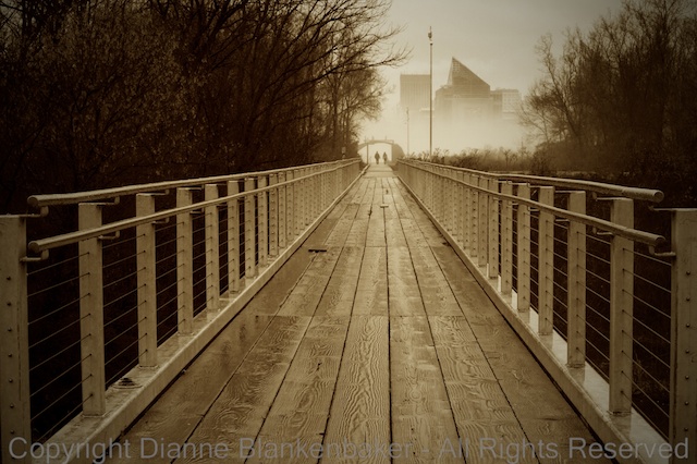
Today, I am going to show you how to take a color photo and turn it into a more nostalgic looking black and white with sepia. I am not frequently a fan of sepia, but this image called out for sepia to me. There is something about the rustic looking wood planks in the bridge leading to the couple headed into the fog against the very modern looking building in the background that made me think “sepia.”
I originally took this image with my DSLR, but because it was in my Photo Stream, it was easy to open it from the iPhone without having to do anything fancy to get it there.
I love Photo Stream when it works. Sometimes, however, images don’t show up when and where I expect them to, which can be annoying. Most of the time, I happily discover all of my recent images on all of my devices just as advertised.
One of the things I wanted to accomplish with the adjustment was to make the couple in the background walking into the fog stand out more. While the bridge and path lead the eye to the couple, in the original version, they were competing with the colors in the trees and the background building for attention. By changing the image to B&W and using a vignette to darken all of the outer objects in the frame, the people in the background pop out more.
To my eye, adding the sepia coloring made the effect even stronger by causing the bridge and path to look brighter compared to the trees, leading the eye more directly to the couple in the distance.
Here are the step-by-step instructions for the adjustments I made in the iOS version of iPhoto on my iPhone 5S:
Your Assignment: Sometimes sepia will perk up an image that otherwise seems rather dull. This, like all artistic choices, is subjective. If you don’t like it, that’s OK–knowing what you don’t like is a great step towards learning what you do like. But give it a try in any case–you can always delete it. Choose an image where the colors are not a key component in the impact of the image and there is enough contrast in the image that the subject will still stand out without color. I find sepia to usually be more appealing when there are architectural features in the image, but I have also used it with owls and vultures and liked it. How do you feel about sepia?


