Lesson 96: iPhoto Mobile and Sepia

iPhoto Mobile has become my favorite photo editing app on the iPhone.  I haven’t used them all, but it’s quick and easy and the editing capabilities are pretty impressive for a mobile app.  Plus, it’s free.  I first introduced iPhoto in Lesson 83 Metadata and also used it in Lessons 84 iPhone Mobile Editing, 85 iPhoto Con Tours, 86 My Silly Dog and the iPhoto Exposure Tool,  and 87 Adding Drama in iPhoto iOS.

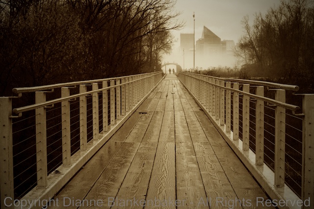
Today, I am going to show you how to take a color photo and turn it into a more nostalgic looking black and white with sepia.  I am not frequently a fan of sepia, but this image called out for sepia to me.  There is something about the rustic looking wood planks in the bridge leading to the couple headed into the fog against the very modern looking building in the background that made me think “sepia.”

I originally took this image with my DSLR, but because it was in my Photo Stream, it was easy to open it from the iPhone without having to do anything fancy to get it there.

I love Photo Stream when it works.  Sometimes, however, images don’t show up when and where I expect them to, which can be annoying.  Most of the time, I happily discover all of my recent images on all of my devices just as advertised.

One of the things I wanted to accomplish with the adjustment was to make the couple in the background walking into the fog stand out more.  While the bridge and path lead the eye to the couple, in the original version, they were competing with the colors in the trees and the background building for attention.  By changing the image to B&W and using a vignette to darken all of the outer objects in the frame, the people in the background pop out more.

To my eye, adding the sepia coloring made the effect even stronger by causing the bridge and path to look brighter compared to the trees, leading the eye more directly to the couple in the distance.

Here are the step-by-step instructions for the adjustments I made in the iOS version of iPhoto on my iPhone 5S:

Your Assignment:  Sometimes sepia will perk up an image that otherwise seems rather dull.  This, like all artistic choices, is subjective.  If you don’t like it, that’s OK–knowing what you don’t like is a great step towards learning what you do like.  But give it a try in any case–you can always delete it.  Choose an image where the colors are not a key component in the impact of the image and there is enough contrast in the image that the subject will still stand out without color.  I find sepia to usually be more appealing when there are architectural features in the image, but I have also used it with owls and vultures and liked it.  How do you feel about sepia?

Lesson 92: Heavenly Bodies


Every once in a while, I take my dog out after dark (which happens a lot more often this time of year), look up, and am inspired to take some photos.  To be honest, the amount of noise in the iPhone night photos continues to frustrate me, even with the iPhone 5S.

But, recently, I was teaching a workshop and I asked if anyone had seen a creative use of noise (all the grainy speckles) in photography and a couple of folks commented that it could be used to create an antique effect.  I’m not sure I’ll ever get to where I make noise a goal, but it does open up some possibilities.

So, tonight, I looked up and saw Venus chasing the moon.  I immediately pulled out my iPhone and gave it a shot.  The images in the gallery were edited using the free, iOS version of iPhoto on my iPhone (see Lessons 84, 85, 86, and 87).  As you can see, they are noisy, but Venus and the moon are worth some noise.

Although the crescent moon turns into a blob, I’m pleased that Venus shows up in most of the images.

Your Assignment:  Don’t be afraid to go for broke on night images just because you’re using an iPhone.  Don’t let any Nokia Lumia-owning friends intimidate you!  However, as you may recall from Lesson 3, zooming on the iPhone is a digital zoom, which will make the noise factor that much bigger.  Instead of trying to zoom in to get a close-up of heavenly bodies at night, try artistically placing landscape features in the scene, giving the sky some perspective.

Lesson 87: Adding Drama in iPhoto iOS

This will be the last iPhoto iOS lesson for a bit.  But, I wanted to show some editing on a “regular” photo rather than using the Paper Camera images I edited in Lessons 85 and 86.

This sculpture recently appeared in a park in my neighborhood.  It’s a pretty dramatic sculpture all on its own, but somehow the drama doesn’t quite translate in the photo taken in the Apple Camera app.  Perhaps because this was taken on an overcast day with very even lighting–as you may recall from Lesson 16, lighting makes all the difference.

In any case, I used iPhoto to bring back the drama and maybe even add a little extra.  Here’s what I did:

Your Assignment:

Choose an image that is lackluster.  Yesterday we played with the Exposure settings.  That’s a good way to add drama as a starting place.  Now try using the saturate brush and “Drama” effect in iPhoto to see if you can create an image that really “pops.”

Lesson 86: My Silly Dog and the iPhoto Exposure Tool

If yesterday’s abstract example hurt your eyes, today’s lesson should at least make you smile.  Well, if you’re a dog lover, anyway.

There is just something fun about the way the Paper Camera app’s Con Tours effect renders my dog.  I think it’s that it outlines his spots and turns his nose into a giant white circle that amuses me so much.  Hopefully you find it amusing, too.

In any case, just as in yesterday’s lesson, I started with a Paper Camera Con Tours image (see Lesson 77 for instructions on Paper Camera) and opened it in the iOS 7 version of iPhoto to see if I could make it a little more exciting.

The Paper Camera version is fun, but it isn’t quite contrasty enough for me.

Here are the steps I used to make my dog stand out better:

Your Assignment:  Use the iPhoto exposure adjustment on one of your photos that maybe looks a little dull or hazy.  Notice that the slider is split into 5 parts.  You can slide the black square at the far left to the right to brighten the whole image.  You can slide the white square right to turn down the brightness.  You can move the 3 markers in the middle to adjust the mid-tones.

This works better in a color image where there is more diversity in the range of tones than in my black and white example.  It’s worth experimenting with this because it makes a big difference in the appearance of your photo.  It also can turn into something pretty awful if you go too far with it–have a little fun!  🙂

Lesson 85: iPhoto Con Tours

Back in Lesson 77, we downloaded Paper Camera and did a bunch of fun stuff with it over several lessons.  Today we’re going to take a Paper Camera image using the Con Tours option and then do some editing with it in iPhoto to see what we can do.

Since I was out hiking with my dog, I took one photo of him and one photo of some trees using Paper Camera Con Tours.  Refer to Lesson 77 for instructions on how to take a photo with Paper Camera and to see an example of Con Tours.

After I saved my two photos to my Camera Roll from within Paper Camera, I opened up iPhoto and did some editing.

Here are the steps I used for the image of the trees (we’ll take a look at my dog in tomorrow’s lesson):

Your Assignment:  Try combining apps like Paper Camera and iPhoto and see what you can do.

Lesson 84: iPhoto Mobile Editing

Yesterday, I introduced you to metadata in the mobile version of iPhoto, a free app from Apple.  Today, I thought I’d show you a combination of using one of the brush editing tools and a filter to take my photo from not very interesting to a more retro look.  I particularly like how the light showing through the leaves in the foreground (left side) looks with the black-and-white effect.


Your Assignment:  Download iPhoto if you haven’t already.  Then open it up and select the photo you want to work on.  Here are the steps I followed for my edit: