Lesson 72: 4S-5S HDR Showdown

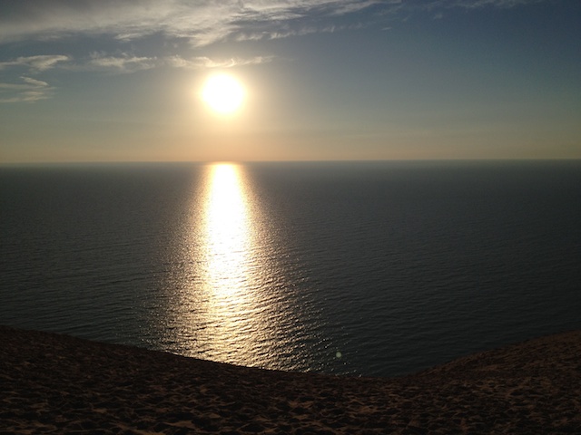
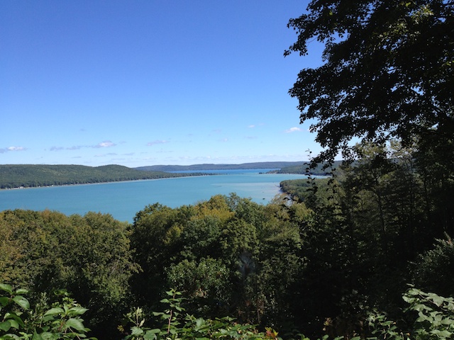
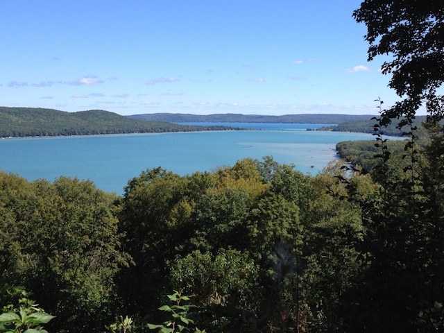
While I was out shooting the sunrise yesterday, I also decided to give the 4S and 5S a test drive with their HDR setting.  As we discussed in Lesson 9, HDR stands for High Dynamic Range and is achieved by combining multiple images with different exposures into a single image, using the best exposure for each part of the image.  As I also mentioned, I did not have much success with the 4S Apple Camera app’s version of HDR.  One of the things I was hoping to see in the 5S was an improvement in the capture of details in bright and dark areas using the Apple Camera app with HDR.

That said, let’s compare the 4S to the 5S with the HDR on:

The major difference between the two (and I spent some time looking at these side-by-side at 200% magnification) is in the light areas around the sun.  Surprisingly, it’s the 4S that has more details in the clouds surrounding the sun, all the way down to the water.  On the flip side, the 4S produced an oddly shaped sun and the color in the sky looks mostly gray while the 5S seems to have smoothed out the sun a bit and captured more blues in the sky.

The bottom line:  if you’re thinking about upgrading to the 5S purely for improved HDR photos, you’ll probably be disappointed.

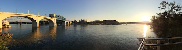
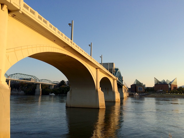
For grins, one more comparison–yesterday’s photos without HDR next to today’s photos with HDR:

Your Assignment:  If you haven’t checked out the Pro HDR app yet, review Lesson 9.  Tomorrow, we’ll talk more about HDR.

Lesson 71: 4S-5S Face-off at Sunrise

The iPhone 5S promises better photos.  It has a bigger opening in the lens for light to come through to allow for better low-light images.  It has a bigger sensor with larger pixels promising more light will reach each pixel and there will be less noise in your pictures.  What does all that mean?  We can see more details in the light and dark areas of photos, we can take better pictures in low-light conditions, and we can expect fewer annoying speckles in our photos.

Now for the test.  While out walking my dog this morning, I happened to be in time to see the sun rising over the Tennessee River just under a low-lying covering of clouds that were in the process of being swept away by the wind.  For once, I was packing both guns with my 4S in my left back pocket and my 5S in my right.

I literally took a point-and-shoot shot with each phone.  I used the default camera app with HDR off for this comparison–I didn’t even tap the screen to set focus or exposure.  I just help up each phone and shot.  Neither photo has had any post-processing done to it.  Drum roll please . . .

This is a a test of extremes.  The sun presents an extremely bright area while the water and bridges provide some very dark areas.  This is the kind of scene that challenges even the most sophisticated cameras.  Can you tell the difference between the way the 4S and the 5S each handle the subject?  Look closely at the sun.  Notice how the 4S version is a bigger blob with less detail in the clouds immediately around the sun.  Additionally, the big bridge support that’s nearly centered is slightly better exposed and shows more detail as well (this may be hard to see without magnifying the full-resolution photo).

Overall, the iPhone 5S also renders the golden light in the photo better–particularly where it is reflected on the water.

So, in short, I’m happy to see there is a visible difference between the two iPhones, but maybe that’s because I just bought the 5S and I’d really like to feel justified in making that decision.  If the difference is so minuscule to you that you can’t see a difference, well, hold the phone . . . we’ll take a look at more comparisons in other lighting conditions to see how the 5S fares.

Your Assignment:  No homework today!


Lesson 70: The Rule of Post-Processing

I mentioned in Lesson 40 that post-processing is the stuff you do to your photo after you take it to make it look the way you want.  Something we don’t always remember is that back when photos were taken using film, part of how a photo turned out was determined by the mysterious person who developed that film and printed our photos.  Unless you had a dark room, you didn’t have any control over how those final steps were performed, yet there is a considerable amount that can be altered in the developing and printing process.

Since that’s about all I know about developing film, let’s talk about how this translates into “developing” digital images.  Back in Lesson 40, I also mentioned that the iPhone (or whatever camera you’re using) makes a lot of decisions for you about how much to saturate the colors, how bright to make the image, how to balance the whites, etc.  For you to have control over what that final photo looks like, you need to change those decisions to your liking.

What you should not do is spend a lot of time trying to fix things that can’t be fixed.  So here are some of the things not to waste your time on:

  1. Focus.  If the focus is very slightly soft, you might be able to sharpen it slightly.  In most cases, it will still make your eyes cross and the photo will look “crunchy” (to borrow a term from photographer John Greengo).
  2. Bright spots that are completely and totally white.  There’s no getting that data back in JPEG photos (which is what you get with smart phones).  If the photo is still tolerable with those blown-out areas, keep it.  If not, toss it.
  3. Dark spots that are completely and totally black.  Just like #2, there’s no getting that data back.  It’s called “clipping” when the camera can’t record the details in dark areas and just records solid black.  Once again, decide if you can live with it or toss the photo.

Proving I am a hypocrite, I was able to find an example photo that contains all three of these problems (yet, I did post-processing on it and tried to save it anyway):

IMG_2809 - Version 3
Blown-out white around the left eye, clipped black in the black on his side, and definitely not sharp!

What can I say–I really love my dog, it’s hard to toss photos of him no matter how bad they are.

We’ve been using Snapseed for editing so far in this series of lessons, but there are other options.  In fact, there are over 2000 photo editing apps in the Apple App Store.  Plus, many of the camera apps (including the iOS 7 Apple Camera app) also have some level of editing capability.  Before you get too crazy looking at different photo editing capabilities, just take it one step at a time.

Your Assignment:

  1. When you take a photo that you thought was going to be really cool, but it’s not quite what you wanted, try the adjustments available in the camera app you’re using to see if you can get what you wanted.
  2. If you can’t, that might be a good time to invest some time using Snapseed.  It’s pretty intuitive once you get through one or two edits and there are plenty of lessons to help you along in this blog (do a search on Snapseed from the iPhonography Lessons page).
  3. As you start getting comfortable with a few adjustments, you’ll find yourself wanting to use them more and more often.  You’ll start recognizing when a photo needs a contrast boost, for example.  Post-processing will become a quick and easy workflow you can apply to the photos you want to keep.
  4. When you have something your really can’t get what you want out of, it might be time to investigate what other photo editing tools are available and what you might be able to do with them.  I’ll be doing some lessons on PhotoForge in the near future.

Lesson 69: The Rule of Protecting Your Gear

In Lesson 19, we talked about cleaning the iPhone lens and your case to make sure you get the clearest photos possible.  In that lesson, I showed the LifeProof case I use with my iPhone 4S, which effectively protected my iPhone 4S from drops, dunks in the river, and miscellaneous abuses for 2 years.

Unfortunately, the new LifeProof case for the iPhone 5S is not yet available.  Instead of buying a case to use temporarily, I thought I could wait it out for the LifeProof case.  As it turned out, I was wrong.  I did one of those moves where I pulled my phone out of my back pocket, lost my grip on it, juggled it back and forth for at least three passes in a desperate attempt to save it, and then it landed face-down on rough pavers, shattering the screen.  The good news is that the camera still works.  The bad news is that I keep getting splinters of glass in my finger tips when I try to use it.

So, for those of you planning to upgrade your iPhone, I thought I would share something I fortunately learned before I ordered my 5S:  AppleCare+, the extra warranty you can purchase with your iPhone (and other Apple products)–now includes coverage for 2 accidental damage incidents in 2 years.  There is a fee for the repair/replacement, but just one breakage more than makes up for the cost of the protection plan and the fee.  Supposedly, they started this when the 4S was introduced, but when I bought my 4S, I was told AppleCare+ did not include accidental damage.  Oh well.

So, to recap, get a case.  Preferably one that will help prevent screen breakage, but some protection is better than no protection.  Second, consider buying AppleCare+ when you get a new phone.  Finally, take juggling lessons.

Your Assignment:  Assess your current damage risk.  Have you dropped your phone and not gotten it repaired?  Is there a risk that your camera will not work when you need it?  Are you upgrading soon?  Consider your own history of accidents.  Are you good at protecting your iPhone?  Are there others in your life who use your iPhone who might not be so good at keeping it safe?  Consider whether you need to upgrade your current case even if you aren’t upgrading your phone.


Lesson 68: Panoramic Upgrade

One of the features of the new iPhone 5S that contributed to my decision to upgrade was the enhanced exposure while taking panoramic photos.  Panoramic photos are just plain fun.  They give you the option of capturing a scene that is far wider than your lens.  And, they let you bend reality into a half circle.

The problem with the iPhone 5S predecessors that support panoramic photos is that the exposure is set by the brightness of the area where you start your photo and then the same exposure is applied throughout the entire shot, even if the brightness of the scene changes dramatically by the time you get to the end of the shot.  This results in images like this one, taken using the iPhone 4S:

Notice how my husband and dog in front of the stone building (all in the shade) are properly exposed, but everything in the bright sun is overexposed.

What changed in the iPhone 5S is that the exposure now adjusts as you move through the process of capturing a panoramic.  The actual steps to capture a panoramic haven’t changed significantly–the only difference is that you now swipe to change modes from “regular” photos to panoramic (or square or video).  For detailed instructions on how to create a panoramic with an iPhone 4S, see Lesson 27.

The fact that the exposure now adjusts allows for panoramic photos with dramatic differences in brightness from beginning to end like this one, shot with the iPhone 5S:

Notice how even with the sun in one side of the image, the exposure is pretty decent throughout.  Of course, this isn’t quite a fair comparison–the 4S example was shot in the middle of the day.

If you’re shooting with a predecessor to the iPhone 5S, you’re best option is to try to start your panoramic in a part of the scene that is about halfway between the darkest and brightest areas of the scene, even if it means you have to crop part of the image away later.

Your Assignment:  Experiment with Panoramic photos.  What kinds of settings work best as panoramic images?  How far away do you have to be from the objects in the scene to avoid bending them into a giant U?  Can you find a way to get a decent exposure with a predecessor to the iPhone 5S?

Lesson 67: The Rule of Golden Light

We have talked about the “Golden Hour” or “Magic Hour” on more than one occasion–see Lessons 16 and 17–but since I managed to get out to shoot briefly during Golden Hour, I thought it was a good time to revisit the concept.

Here’s the rule:  virtually anything you want to photograph will look better during the golden hour on a clear day than at any other time of day or under manmade lighting.  Since it would be unlike me to imply that any rule is always true, one exceptions that comes to mind is photos of objects, which can look great shot outdoors during the golden hour, but if you have some really specific details you’re trying to capture, manmade lighting might be easier to deal with.  Photojournalists have been known to scoff at the luxury of being able to shoot during the golden hour–history happens when it happens, not around the timing of the best lighting.

That said, if you have the opportunity to shoot during the golden hour, take it.  As I mentioned in Lesson 17, there is an app for that.  It’s called Magic Hour and you can set it to tell you an hour ahead of time when Magic (or Golden) Hour begins as well as when it actually starts and it will even countdown magic hour for you.

That said, I am currently living in Chattanooga, Tennessee.  Chattanooga is surrounded by ridges and (small) mountains.  These high-elevation features make for great scenery, but they also block the sun.  My Magic Hour alarm went off at 7:37PM.  By 7:55PM, the only things still being hit by golden light were the tops of the tallest buildings around.  Geographical obstructions make for a very brief golden “hour”–more of a golden 15 minutes!

In any case, in those 15 minutes, I happened to be out walking my dog along the Tennessee River, so I grabbed some shots.  It’s hard to resist when the light is so pretty.

Your Assignment:  Try to get out during the golden hour with your iPhone (or other camera) handy.  Stay out of ravines that run North and South or you won’t get much light.  You can look up magic hour for your part of the world on a given date here:  http://www.golden-hour.com  Notice the difference in the color and angle of the light.  Try photographing things that you have photographed in other light conditions.  If you can, compare the photos and see if you can tell the difference the lighting conditions make.

Lesson 66: Pink Clouds, HDR, and the iPhone 5S

The other night, I looked up and saw pink streaks in the clouds directly across from me.  The sun was setting off to the side, out of view, and causing a lovely color display in the clouds to the North.  I pulled out my iPhone 5S and using the default camera app, took a couple of photos with the HDR turned on as well as with HDR turned off.

As I mentioned in a previous post, I never got a noticeable difference with the iPhone 4S, which is why I rely on the Pro HDR app for scenes with extreme differences in brightness.  I thought I’d give the new iPhone 5S a chance to show me just how gloriously the camera improved.

Here is a side-by-side comparison of the HDR version and the non-HDR version:

Can you tell a difference?  There’s a subtle difference in the exposure of the dark trees in the background; otherwise, they’re pretty identical.

That was disappointing.  I pulled out the Pro HDR app and tried again to see if that worked better.  Here’s the Pro HDR version next to the Apple Camera HDR version:

Pretty big difference.  Not sure why I got the bright strip down the left side of the Pro HDR version.  Unfortunately for me, the sun set before I could try again–I’ve not had that happen before.

What I like about the Pro HDR version is the more intense contrast in the clouds that better shows off the pink against the dark gray–which is more what it looked like when I was standing there.  What I don’t like is that the properly exposed buildings in the foreground become more distracting when the sky is the subject.  And, of course, the bright stripe down the left side!

Next time, I will have to do a comparison of the 4S and 5S to see if there is a significant improvement between those too.  The trouble with grab shots is that you only have time to grab the camera you have with you.

Your Assignment:  Regardless of which version of the iPhone you have, if it has the HDR option, try taking some photos of scenes that are very bright in some parts and very dark in other parts.  Take a look at your photos and see if turning the HDR feature on makes a difference in the amount of detail you get in both the light and dark areas.  If you wold like to try the Pro HDR app in comparison, check out Lesson 9.

Lesson 65: Sunset Makeover

OK, this is the 3rd and final makeover post of Gina’s vacation photos (at least for now).  This time, we’re going to take a look at my favorite photo of the 3 Gina sent me.   I love this photo.  I love dramatic contrasts and I never tire of sunsets.  This one has lots of appeal with the way the light is reflected on the lake.  The exposure is great and the focus is perfect.

Here is the original photo Gina sent me:

Original Photo from Gina

She felt it was too dark.  Specifically, the foreground.  Without understanding what Gina was shooting for (sorry for another pun), I looked at it and said, “Oh, this would be great shot symmetrically.”  To simulate what that would look like, I used Snapseed to crop the photo a lot (and to turn up the contrast a touch and did a slight straighten) to get this:

Cropped to simulate a vertical, symmetrical version

Gina liked it, but she said she had liked the curved beach in the foreground of the scene–that was the part that was too dark.  Realizing I had missed the beach entirely, I went back and tried again.  This time, I used the Brightness Selective Adjustment in Snapseed to brighten up the beach along with a very slight contrast and straighten adjustment.  This is what I got:

Beach brightened just enough to show itself in the foreground

Gina liked both versions.  Her comment was that it was cool to see the same thing two different ways.  I agree.  I often shoot a subject vertically, horizontally, using the rule of thirds, using symmetry, standing up, laying down, and anyway else I can think of.  Sometimes I get nothing.  Sometimes I get several shots I love.  But what I hate is when I get home and look at my photos and think, “Oh, if only I would have shot  _____ way.”

One final comment:  it’s pretty tough to get an exposure that works for the beach, the water, and the sky.  The only option is the Pro HDR app, which isn’t necessarily going to work that well for a sunset (depends on how fast things are moving and how well you can hold still).   Plus, Pro HDR probably wouldn’t have created the dramatic contrast between the sunlight and dark water.  Using apps like Snapseed to adjust after you shoot lets you decide how you want different parts of the photo to look–something the camera just doesn’t always predict well.  They’re still working on the mind reading camera.

Your Assignment:  Try this checklist the next time you’re taking photos of something (of course, not all of these work for all subjects):

Screen Shot 2013-10-01 at 8.29.10 PM

Lesson 64: Photo Makeover Landscape Style

Gina sent me a second photo that she wanted some input on, also from her recent vacation on the lake.  Her question was, “This one is boring.  Too many trees?”  Here’s the original photo from Gina:

Original iPhone 4S photo taken by Gina

There are times when you walk around a lake until you find the perfect, sweeping landscape view and get a dream shot.  Then, there are times when you’re on vacation, hanging out with friends, maybe having an adult beverage or two, and you happen to really enjoy the view and you’d like a picture of it.

These are the times that you whip out your camera and you get the view that you have.  But then, you look at the photo and you think, “Gosh, it looks so much better in person.”  I find that most of the time, things look  further away in a photo than in person to me.  This is especially true with the iPhone’s very short focal length–it spreads things apart and makes them look more distant than they do when you’re standing there looking at the scene–don’t ever let anyone tell you photos don’t lie.

In this case, because Gina asked if there were too many trees, I looked at the sky to see if it was doing something dramatic and compelling.  It wasn’t.  So, I decided to try cropping the photo to a simple rule of thirds composition where the line between the far edge of the lake/trees and the sky fell at the top ⅓ horizontal line (see Lesson 52).  This puts the focus more on the lake and less on the sky.  It also pulled us in a little closer to the lake, making it feel bigger.  I also straightened it slightly, but those were the only two edits I made–the exposure is perfect and the focus is great.  Here’s the edited version:

Slightly edited version of Gina's photo
Slightly edited version of Gina’s photo

I used Snapseed to edit.  To see how to crop a photo in Snapseed, go to Lesson 41.  Now, just to make it easier to compare, here are the two versions side-by-side:

Your Assignment:  Which version of the photo do you like better?  Do you know why you like it better?

Take a look at a landscape photo you’ve taken where maybe it doesn’t quite work the way you’d like it to, but you’re not sure why.  Did you apply the rule of thirds to the photo?  Can you crop it to create a rule of thirds version without removing any important elements?    Do you like it better?  Are there other issues with the photo that you can identify?