In yesterday’s post, I mentioned that some HDR processing takes the image to the point that it no longer looks like a photograph. To give you an idea of the range of HDR-type processing possible, I did several different versions of HDR images using 5 photos taken with my DSLR at different exposures and combining them using Photomatix, a software tool used on a desk/laptop to combine exposures.
I realize this is cheating since this blog is about iPhonography and not about DSLR photography, but I thought it was worth the cheat just to give you an idea of the kinds of looks people may be thinking of when someone says “I don’t like HDR.”
Here is the range of looks I created for examples:

Photographic Style

Soft Style

Natural Style

Painting look

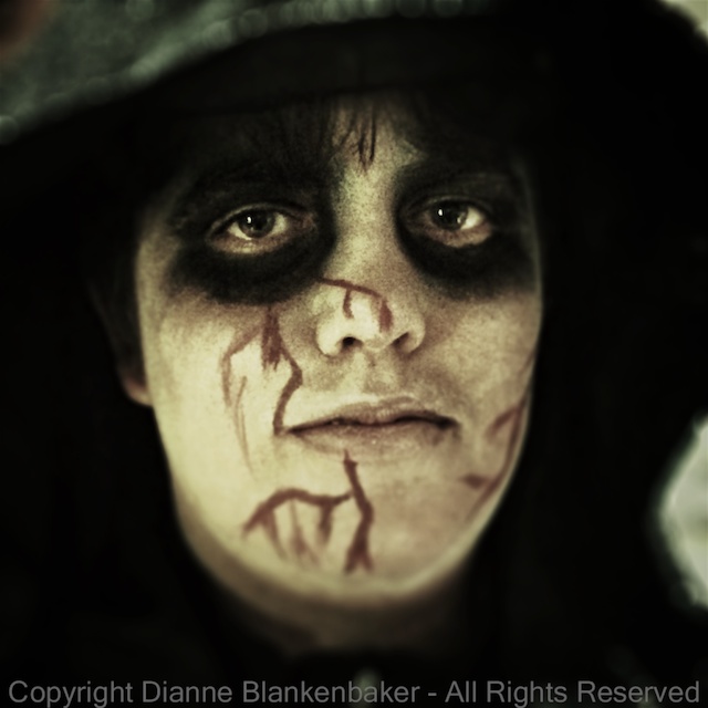
Grunge Style
I do not have scientific data on how people respond to these different types of looks. However, the anecdotal evidence I have is that people do not notice the HDR effect in the more subtle examples at the left; they just think it’s a “regular” photo. As the photo moves from looking like a photograph to looking like a painting to looking like a painting gone horribly wrong, my experience has been that most people really like the painting look the first time they see it. They like it the second time they see it. They might even go a little nuts over it. Then, at some point, they start to think it looks, well, to borrow a term from my husband, “kitschy.”
Of course, there are no rules, and I have seen this look applied artistically.
For example, I really like the work of a fellow blogger and iPhoneographer extraordinaire, Davide Capponi. Davide does extraordinary things with iPhoneography by using multiple editing apps to create something that transcends photography. Here is an example of one of his images that started with Pro HDR. If you peruse Davide’s work, you will find that few of his images look like photos, yet I can’t imagine anyone calling them kitschy.
To me, the difference between “kitsch” and art is hard to define. To a certain extent, when you see the exact same look produced over and over again by many different people, it starts to look kitschy. When you see something that is truly unique, it stands alone.
Your Assignment: Are you interested in just taking pleasing photographs with your iPhone, or does the thought of using it as a medium to create unique art excite you? If you fall into the latter category, I suggest you spend some time looking at Davide’s work. Davide records what apps he used for taking the photo and for editing. You’ll notice he often uses a combination of 4+ apps to create his final image. Do you find yourself inspired?