Lesson 30: Awesomely Hip Portraits

Let’s talk about different kinds of portraits–or, pictures of people.

To keep it simple, let’s use 3 general categories for the purposes of our discussion:

  1. Traditional Portraits – “It’s all about you”
  2. “You were there” portraits
  3. Landscape portraits.

In the first category, traditional portraits are all about the person and any background is just a “mood setting.”  In the second category, there’s a balance between a setting and the person (see Lesson 22).  The difference being that a “You were there” portrait puts a person in a specific place that isn’t where they would normally be found.

In our final category, there’s the kind of portrait that’s more about the scene and the people provide more of a “mood” or sense of scale.  I thought I made up the term “landscape portrait,” but it turns out there’s a group on Flickr on the subject.  Great minds.  😉

If you’re in a setting that’s worth photographing and you also have people with you, it’s good to think about these 3 choices.  Since my husband, dog, and I took a hike to a beautiful waterfall this weekend, I created examples using a couple of different combinations of lenses and films in Hipstamatic to show you the differences.

For a more traditional portrait, the Tinto 1882 lens we used in Lesson 24 works quite nicely.  As you can see, the facial recognition does a good job of keeping the face sharply in focus while the rest of the scene blurs.  To keep the background from getting too distracting, I took these in front of some stone steps instead of the waterfall.  I used the Black Keys Fine film (available for free download from the shopping cart in the app) for the photo on the left and the Kodak XGrizzled film we used in Lesson 13 for the photo on the left:

I like the Black Keys film for a crisp black and white look.  The Kodak XGrizzled film makes for a color photo with character.  I would have also used a neutral film, but my model was starting to grumble about mosquitoes.

To get more of a balance between the setting and the “people” (including my canine kid) for a “they were there” portrait, I positioned myself much closer to the people.  I also switched from the Hipstamatic app to the Camera Awesome app to get a “normal” photo:

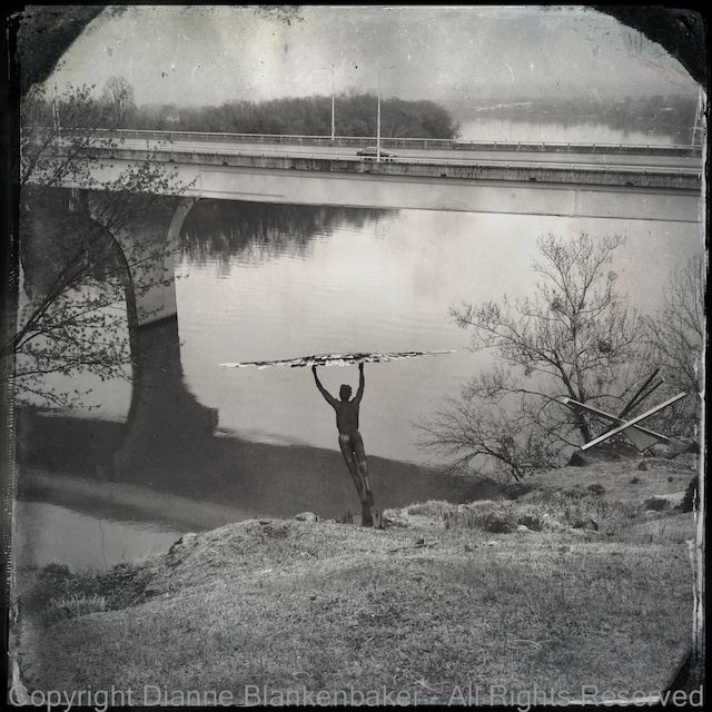
For the landscape portrait, I did two completely different looks.  First, I used Hipstamatic with the Helga Viking lens and D-type film. Second, I used Pro HDR.  In both examples, I included the entire waterfall and had my husband looking away from the camera.  My dog was not so cooperative about where to look.

In both photos, the clear subject is the waterfall and having people in front of it creates a sense of scale as well as a different mood than, say, the waterfall by itself.  Compare a similar Hipstamatic photo with the same lens and film side-by-side with the one with my husband and dog:

How would you describe the difference in the feelings evoked by the two photos?

Your Assignment:  Take a cooperative person with you to an interesting setting.  It doesn’t have to be a waterfall–an interesting building can make an equally compelling photo.  Try using the different combinations of lenses and films in Hipstamatic in the different styles of portraits we discussed.  Try with Camera Awesome and Pro HDR, too.  Compare the photos.  Which do you like best?

Lesson 29: Hipsta-Classic

In lesson 13, I introduced the Hipstamatic App.  In lesson 24, we used the lens from the tintype pack.  Today, we’re going to use Hipstamatic with the D-type film and the Helga Viking lens.  The Helga Viking lens is part of the Williamsburg Starter Hipstapak; refer to lesson 13 on how to purchase additional hipstapaks.

I am particularly fond of this combination–I tend to like virtually everything photo I take with it, no matter what the subject is.  As someone who does a lot of landscape photography, I appreciate the front-to-back depth of field the Helga Viking lens provides–it works great for big landscapes.  Add to that the look of black-and-white tintype and you have instant classics.  Take a look at the gallery at the top of this lesson for examples.

Lesson 13 also explains how to change the lens and film in the Hipstamatic app.  One thing I didn’t explain in lesson 13 is that Hipstamatic has a feature that will select the lens and film for you when you shake your phone.  I do not like that feature–it causes me to end up with a different lens and film than I wanted when I least expected it.  So, let’s turn that off:

A handy feature that I use is setting a combination of film and lens as a favorite so it’s easy to pick that combo when I’m in a hurry.  Once you have the D-type film and the Helga Viking lens set, click the curved arrow at the lower right to turn the camera around and you’ll notice a star at the bottom of the case.  Here are the steps to save the combination as a favorite:

Now that it’s saved, to pick this combo, just tap on the star and then scroll through your saved favorites and pick this one.  It saves time in that you don’t have to switch to the back view of the phone and scroll through the lenses and film separately.

Now that you’ve got the Helga Viking lens and D-type film, it’s time to go shoot!

Your Assignment:  Try this combination in both indoor and outdoor settings.  Compare the photos you take to the ones you took in Lesson 24 with the Tinto 1884 lens.  Notice how what’s in focus is dramatically different?  What kinds of subjects do you like best with this lens?  Do you like having everything in focus compared to the Tinto 1884 lens?  Are there some subjects that work better with the Tinto 1884 lens than with the Helga Viking and vise versa?

Lesson 24: Using Hipstamatic to Include and Exclude

In yesterday’s lesson, we talked about making choices to include or exclude different parts of a scene.  I showed you some examples that were all shot vertically and talked about the fact that this in itself is an act of exclusion and inclusion.

Now, I’d like to continue that lesson in the context of an app we downloaded several lessons ago, Hipstamatic.  We’re going to use a lens from an add-on pack, the Tintype pack.  It includes both C-type and D-type film along with the Tinto 1884 lens, which is the one we’ll be using.  For details on changing lenses and making purchases, see Lesson 13.

Hipstamatic introduces a couple of interesting choices in the context of inclusion and exclusion.  First, the frame is square.  It doesn’t matter if you turn your phone horizontally or vertically, you get the same stuff in the frame (believe me, I forget this almost every time I launch Hipstamatic and try turning the phone until the realization that it is still a square hits me, usually resulting in me smacking myself in the forehead for my stupidity).

Having a square frame makes a considerable difference in how you visualize your subject when it comes to inclusion and exclusion.  There is something totally different about taking a square picture over taking a rectangular one–the 1-to-1 proportion changes the balance of the photo and cuts things out that you might include in a rectangle.  If you’ve started seeing the world in a rectangle, it’s a great time to get out Hipstamatic and try shooting square.

Hipstamatic also introduces some unique effects on the photos that can include and exclude by where the eye is drawn.  For example, the eye is drawn to sharply focused areas in the photo.  Compare these two photos:

Notice that in one, my husband is sharply in focus while in the other, my dog is.  This dramatically changes what the photo is about even though both photos are otherwise quite similar.  To create this largely out-of-focus look, I used the Tinto 1884 lens.  One of the challenges of using this with the D-Type film shown is that you can’t select where to focus.  If you tap the screen, it takes a photo.  This makes it a bit of a trial and error game to get what you want in focus.  Based on testing with the Tinto 1884 lens, it seems that about the center of the frame will be in focus if there are no recognizable faces (notice my husband’s face was covered by the wind blowing his hair in the second photo).

However, take a look at these two examples, also using the Tinto 1884 lens:

Notice how in one, the rock in the background is sharp while in the other, the rock in the foreground is in focus.  The foreground rock is not in the center of the frame–however, if you squint, you can find a “face” in the pattern in the rock.  Ironically, facial recognition does not work for dogs even though it seems to work for rocks.

My advice, take several photos and check what is in focus.  Changing the angle you’re holding the camera to the subject may help Hipstamatic focus where you want–refer to the earlier lesson on holding the phone square (although you may need to do the opposite to get the focus you want).  If you are taking a portrait of a human, the facial recognition will work quite well as long as the human is somewhere near the center of the frame.

Your Assignment:  Pick a subject that you’ve taken photos of before using a rectangular frame.  Consider how the square shape of Hipstamatic affects what you can include in the photo.  Try different compositions to see what works best in the square shape.  If you have purchased the Tinto 1884 lens, try this lens to see what you get in focus and what you don’t.  Are you able to control what is included in the photo by the focus?

Lesson 16: Outdoor Light

Since there are many circumstances to think about when it comes to light, for today’s lesson, we’re going to limit our discussion to taking landscape photos outdoors.  We’ll periodically revisit lighting issues in future lessons.

If you’re taking photos while you’re on a trip or visiting with friends, it can be very difficult to be selective about what time of day you’re taking pictures.  However, if you are sitting down to talk about what you’re going to do in a given day, you might think about timing a visit to a scenic overlook early or late in the day around the sun.

You may have heard someone mention the “golden hour” or the “magic hour” from time to time.  This refers to approximately the first and last hour of light in any given day.  During this hour, light takes on a golden hue due to the angle of the sun and can make for some really spectacular landscape lighting.

Because the golden hour varies from day to day and place to place, you may find the golden hour calculator useful.  It will show you the start and end time of the “golden hour” at the beginning and end of each day for your location.  You’ll notice that the “golden hour” isn’t necessarily a full hour.

Another thing to be aware of is that even if the light is no longer golden, you can still get better lighting earlier or later in the day just because the shadows are less harsh.  If getting out and about super early in the summer for the golden hour isn’t feasible, generally you will still get better photos at say 9:00AM than at noon.

As a rule of thumb, when you’re planning activities that you know will inspire you to take lots of outdoor landscapes, try to plan them before 10AM or after 7PM in the summer.  For now, if you’re going to be photographing outdoor landscapes in the middle of the day, you might want to refer back to the lesson on using the Pro HDR app.

In the gallery for today’s lesson, you’ll find several photos of the same scene at different times of day to demonstrate the difference in lighting.  Unfortunately, another reason why it might not be worth getting out of bed on a Sunday for the golden hour is the weather may prevent it from happening.  Additionally, I apparently can’t see first thing in the morning because I failed to realize my early morning photo was blurred!

When you look at the gallery, notice the difference that the bright sunshine vs when the sun was behind a cloud makes.  Overcast skies create flat, even light, which people tend to find less interesting in landscapes, but it works well for other scenarios we’ll cover later.  Also notice that because of the trees on the East side of the pedestrian bridge in the foreground, the evening light is far better than the morning light.

Jumping back to the weather–check the forecast.  My husband recently planned some sight seeing for visiting family.  He took them to the aquarium on the first day when it was a beautiful, clear, cool summer day and then took them to walk in a scenic park the next day when it was cloudy, hot, humid, and bursting into thunderstorms.  Checking the weather before you decide when to do indoor vs outdoor activities will make for a better experience in general, not to mention what it does for your photos.

Your Assignment:  Try looking up the golden hour for a day when you can make time either early or in the evening to take photos.  Check the weather forecast and finalize a date to put on your calendar.

Choose a place you would like to take photos.  This is a really great assignment for that cool neighborhood a few miles from home you’ve always wanted to take pictures of but keep forgetting.  Or how about heading to whatever counts for downtown in your neighborhood?  A neighborhood park will also work.

You don’t have to have an overlook to notice the difference the light will make.  If you have enough patience and time, take a picture of the same scene every 10 minutes from the start of the golden hour until an hour after it’s over (yeah, I know, that might be asking a lot).  Hopefully there’s a comfortable place to hang out.  🙂  Without doing any adjustments to your photos, compare how the lighting in the scene changes as the sun moves higher in the sky.

Lesson 14: Another Way to Be Hip

In yesterday’s lesson, we used an included “lens” and “film” in Hipstamatic to create some interesting effects in our photos. One of my personal favorite combinations in Hipstamatic is the combination of the Helga Viking lens and the D-type plate film, which creates a black and white, tintype effect.

However, that lens and film combination costs extra, so I thought today we would look at how to create a similar effect using the Camera Awesome app, downloaded in lesson 7 and further explored in lessons 8 and 12.

One of the differences between the two apps is that in Hipstamatic, you frame and shoot and you’re done. In Camera Awesome, you have more decisions to make while shooting and then you apply different edits to get the effects. The disadvantage is the time it takes. The advantage is that you have a “normal” photo to work with and you can always get back to the original to try something different. In Hipstamatic, you get what you get.

I often take photos with Hipstamatic and then take a similar photo using Camera Awesome or my DSLR so that I have both the Hipstamatic version and something I can control. I always have to laugh when I’m standing somewhere with my DSLR hanging around my neck while I’m taking a picture with my iPhone.

In any case, let’s take a look at what the tintype effect in Hipstamatic looks like compared to using edits in Camera Awesome.

This is what I got using the Helga Viking lens and D-type plate film in Hipstamatic of my dog taking possession of my husband’s shoes:

IMG_0012

I took a similar image using Camera Awesome and started with this:

IMG_2882

I tapped the magic wand to get into the edit screen, and then did the following (click to enlarge):

camera awesome vintage.001

Next, I added a preset and a filter. If you need detail instructions, you can look back at lesson 12, just choose the Lone Star preset and the Cyanotype filter.

camera awesome vintage.002

Finally, we’re going to add a frame to the photo–I didn’t show all the screens, but it’s basically a repeat of selecting a filter. The main difference is when you’re done, it’s time to tap the done button.

camera awesome vintage.003

Now, let’s compare the Hipstamatic to the Camera Awesome version:

I did this same exercise with a landscape photo of the fog in the hills this morning. I added a square crop to better emulate the Hipstamatic look, which is done using the “Transform” option from the editing choices. Here’s a comparison of the results:

Your Assignment: Find three types of subjects to photograph: a person or pet to photograph up close, a room or garden to photograph from a bit further back, and a large open area to photograph from far away (like up the length of your street). Using Camera Awesome, photograph all 3 of these subjects. Now try applying the editing instructions to see which of them you like best with this type of look. Which kind of subject do you like best?


Lesson 12: Awesomization

Today we’re going to do something really fun.  We’re going to take an ordinary photo and turn it into something complete unique from anything you’ve ever produced with an ordinary camera.  This lesson does require an iPhone.  We will be using the Camera Awesome app we downloaded back in Lesson 7.

I started by applying yesterday’s lesson on symmetry to taking a very close-up picture of a large, silk flower.  You can choose whatever you like for your subject and framing, but taking a close-up is probably a good idea for today’s lesson.  Use the Camera Awesome app to take your photo as a starting place.

20130808 A Little Fun.001

Now that you have a picture, you’re going to open it and perform several editing steps all inside the Camera Awesome app to create a completely different look.  Start by opening the photo in the app and getting into the editing screen as shown in the example below (click to enlarge).  Also try the Awesomize slider to see if it improves your image.

20130808 A Little Fun.002

Next, we’ll try the “Transform” option to apply cropping to really get rid of any distracting background we can.  You’ll notice in my example below (click to enlarge), I still have a distracting bright area in the upper left corner of the photo even after I crop.

20130808 A Little Fun.003

Now let’s get really creative!  Let’s try the presets available.  Now, Camera Awesome offers a bunch of presets if you keep scrolling through the categories (flick to the left to see more groups of presets).  However, only the first category is free.  You have to pay $5.99 to get the other options.

20130808 A Little Fun.004

In this case, I chose Road Trip because I liked that it both reduced the glare of the bright spot and brightened the flower in a nice way.

Next, I decided to apply a filter.  Again, only the first category of filters is free.  I picked the Cyanotype because, combined with the Road Trip preset, it did some pretty cool things to my photo.

Once you’ve picked the filter you like (click “Undo” if you don’t like any of them), it’s time to click the “Done” button.  This applies your changes and save the edited image.  But before you go anywhere, make sure you also export at least your edited image.  (You may also want to export the original image.  You can go back to the same photo to export the original after you export your edited version.)  See the following example (click to enlarge):

20130808 A Little Fun.005

Now your lovely new picture is in your Camera Roll.  You can open it up and view it full screen and share it at will.  This is what my final picture looked like:

Awesomized

And this is what the original and edited version look like side-by-side:

20130808 A Little Fun.007

You’re Assignment:  Pick a subject that’s interesting close up and has some texture or a pattern of some kind.  A big, silk mum is great because it has a very dimensional texture vs, say, carpet.  However, even carpet can be interesting up close.

Use Camera Awesome to take a picture–remember to focus and expose separately if that helps.  Make sure you’re far enough away that the iPhone can focus–if you’re pictures keep coming out blurry, you may be too close.

Now use the step-by-step instructions above to play with the editing capabilities of Camera Awesome until you get an image you like.  Don’t forget to export it!

Which image do you prefer?  The original or the modified picture you created?

Lesson 10: Taking Stock

The inspiration for these lessons, my best friend Gina, reports that her photos are getting worse instead of better.  This is a common experience–there are many reasons for this phenomena:

  1. You are developing an eye and you are seeing more of the shortcomings of your photos than you did in the past.  A photo that you thought was the best photo ever suddenly looks flawed with new found knowledge that influences your taste.  You might look back at the photos you selected in Lesson 1 to see if you see flaws in them you didn’t notice when you selected them.
  2. You are learning new skills that take time to get comfortable with.  A certain amount of physical dexterity is required to hold an iPhone level and stable while you choose focus and exposure options and click the button to take the photo.  You may not have developed the fine motor skills required to do this well.  You are also learning new things to think about when you set up to take a photo.  It can be confusing to have to decide which app to choose, how to apply the rule of thirds, think about holding the iPhone with good form, and decide how to set exposure and focus.
  3. In Lesson 1, I told you there were no rules.  But in the subsequent lessons, I introduced a series of “rules.”  When we are young and learning our language for the first time, we lack the experience to know when a new rule doesn’t apply.  For example, children often add “-ed” to the end of words inappropriately when they first start acquiring the skill of forming the past tense in English:  “I goed to the store with Mommy.”  Similarly, when you are learning a new rule, it’s hard to judge when to make exceptions.
  4. If you are dutifully doing the assignments at the end of each exercise, you are probably photographing whatever is most convenient to complete the exercise.  How interesting photos are is largely dependent on the subject you’re photographing.  Although we will eventually learn how to make seemingly uninteresting things interesting, if you look back at the photos you picked in Lesson 1, you may find that they are of particularly interesting places or people.  It’s hard to make up for that with basic skills.
  5. The 9 lessons so far are not enough to take your photos from ordinary to extraordinary.  I suggest looking at the example photos I used in the lessons (included in this post for your convenience).  You might notice that none of them appear in my iPhonography Gallery page.  This is because I don’t like them.  They are not great photos–they are exercises.  We have not yet gotten to lessons that expose the power of using an iPhone as a camera.  That power is not in its ability to capture great details or strong contrasts.  The power of the iPhone is in the range of applications available to easily do really creative things with the photos you take.  Be patient–we’ll get to those lessons.
  6. In digital photography, the equivalent of developing film is called post-processing.  This means after the photo is taken, it’s adjusted using software to make it look better.  We haven’t gotten to using any of the tools available for adjusting photos, so you are looking at photos that are merely “negatives.”  We’ll get to post-processing–just know that your photos aren’t really done yet.

Your Assignment:  Take a look at the photos you created as part of each lesson.  Take stock of what you learned from each exercise.  Do you have better control of where you focus?  Are you framing your subjects in new ways?  Are you better able to control the exposure you get?  Congratulate yourself for what you’ve learned, no matter what the photos look like.

Lesson 2: The Rule of Thirds

In our last lesson, I explained that rules are just a way of organizing the choices you can make when you take a photo.  The rule of thirds is one of those choices.

The iPhone default camera app can be set to turn a rule of thirds grid on in the Options menu.  Most camera apps and point-and-shoot cameras have this option.  This is what it looks like with the grid on:

iPhone camera with grid on

The grid divides the frame into thirds both horizontally and vertically.  For many subjects, placing the subject so that the most important feature aligns with the intersection of one of these lines can make the subject grab the eye much more effectively.

Here’s an example.  First, in the next image, I’ve centered my dog’s head in the frame:

Subject centered in frame

In the next image, I placed one of the grid intersections on my dog’s left eye:

Rule of thirds grid 3

I chose the lower-left intersection in the grid because it allowed me to get his front legs in the frame as well.

Which one do you like better?

Your Assignment:  Turn the grid on in your camera app or camera if it has it.  If not, you can imagine where the grid would be by guestimating.  Pick a subject that isn’t moving like a flower or a vase or a sleeping dog.  Try photographing it centered in the frame, then try each of the 4 intersections of the rule-of-thirds grid.  Which do you like best?

Lesson 1: There are no rules

I am going to share a lot of “rules” with you as we go through some basics that will help you grab photos with more impact using your iPhone.  Before I do that, I just want to be clear that rules aren’t really rules.  You aren’t a bad person or even a bad photographer if you break the rules.  In fact, many of the most iconic photos break several “rules,” so it’s a good thing.  The trick is knowing that you broke the rules and knowing why.  Knowing what choices you can make gives you the power to make them.  That’s what “rules” are really for–helping you get a handle on all the choices.  So, the first lesson in photography is that rules are only rules when they’re helpful.

Your assignment:  pick a handful of favorite photos and take a look at them.  Imagine they were taken by someone else.  Imagine you didn’t know anything about the people, places, or things in the images.  Would you want to hang them on the wall?  Why or why not?