Lesson 23: Inclusion and Exclusion

Continuing on yesterday’s theme, we’re going to talk a bit more about what “filling the frame” really means.  This lesson applies to any camera.

When you hear people talk about “filling the frame,” it’s a little confusing because, of course, the frame is always full when you take a picture.  It can be full of the fabric on the inside of your back pocket if you happen to be bad about sticking your phone into your pocket with a camera app still running.  The frame can be full of sky, ground, sea, people, and/or miscellaneous stuff you never noticed when you were taking the picture.

One of my favorite examples of “stupid vacation photos” from my personal collection is a photo I took of my husband with a giant statue in the background looking like it’s sprouting out of the top of his head.

When we’re talking about filling the frame with the subject, we’re really talking about excluding anything that distracts from the subject and including anything that adds to it.  While this may be a simple statement, it’s surprisingly difficult to achieve.  Since we talked about landmarks in yesterday’s post, let’s talk about what that means when we’re photographing a subject like a large bridge, scenic riverfront, or other expansive views.

As a side note, since this lesson applies to all cameras, I’ve used photos taken with a DSLR camera rather than an iPhone.  This allowed me to reuse photos from an earlier shoot rather than having to go reshoot with the iPhone.

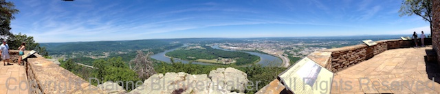
Let’s take a simple example.  We’ll look at 3 photos of the Walnut Street Bridge from under an arch of the Market Street Bridge.  Each one includes and excludes different things, but all 3 have something in common:  they were shot on the vertical.  It’s somewhat unusual to take pictures of bridges vertically–choosing to shoot vertically or horizontally is often the first act of inclusion and exclusion.  By choosing the vertical, I was able to make the sky, water, and ground important elements of the photos but get tight enough to keep the Walnut Street Bridge an important part of my overall composition.

Let’s start with 2 very similar versions.  Both include a portion of the bow of the Delta Queen (a retired paddle boat that is now a floating hotel) peeking around a pillar of the Market Street Bridge in the foreground:

Notice the difference between the two at where the view of the Walnut Street Bridge ends.  The second photo includes about half of the third section whereas the first includes less than a quarter.  This subtle difference makes the second photo slightly more about the Walnut Street Bridge.  However, both photos have the same problem–both the Market Street Bridge in the foreground and the Walnut Street Bridge in the background are awkwardly cut-off in the middle of a symmetrical shape.

Now, here is a 3rd similar image next to the first two:

Notice what’s excluded from this photo compared to the first two.  The Delta Queen is gone.  The first vertical support on the Market Street Bridge has disappeared.  Notice what’s included.  The far end of the Market St Bridge arch is now in the frame.  An extra light also appears on top of the bridge.  We now see all of the Walnut St Bridge that is visible under the arch.  We even see part of a second arch in the Market Street Bridge.  Because the end of the first arch is fully in the frame, but just barely, the point where the foreground bridge is cut off feels less awkward to me.

In the process of changing what was included and excluded, I also changed my angle to the bridge.  This creates a nicer diagonal that draws the eye into the image.  You might also notice how different the lighting looks in the different photos.  The sun was shifting through cloud coverage at sunset when these were taken, so there were some unusual and interesting shadows to work with.

I prefer the third photo.  I might have liked it better if the first vertical support in the Walnut Street Bridge were fully visible, but, in general, I like the way the structures are cut off in this one better.  I also prefer the angle of the bridge, and the simplification of the scene by removing the Delta Queen.

Your Assignment:  Take a large subject like a bridge and try different approaches to what you include vs exclude.  Pay attention to the architectural shapes in the frame and where they are getting cut-off.  Try different angles to see if you can find a way to cut-off those shapes in a way that is visually pleasing.  Particularly look at the edges of your frame as you decide what to include and exclude, but don’t forget the rule of thirds.  This is usually a great rule to use for this kind of photo.  And, of course, never forget rule 1–there are no rules.  You may find you can create an abstract-looking photo by cutting off a structure very awkwardly.  Sometimes that can be fun, too.

Lesson 22: People and Landmarks

Today, we’re going to switch gears and revisit an earlier lesson on filling the frame.  This lesson applies to any camera.

In lesson 3, we talked about filling the frame with your subject.  But what do you do when you have two subjects and one is very large while the other is very small?  This is a classic dilemma that most people face when on vacation.  You’re at the grand canyon and you want a beautiful sweeping view of the canyon but you also want to have the people with you in the photo.  What to do?

How many times have you seen photos from someone’s vacation (and perhaps your own) that look like this:

This is the Walnut Street Bridge in Chattanooga, Tennessee.  It’s an extremely popular subject for photographers and tourists alike.  To get this example, I accosted a young couple visiting and stood where the boyfriend was standing to take about the same photo he took.

Since I was interrupting perfect strangers in the middle of their photo session, instead of asking the girlfriend to move to where I wanted her, I moved to where I could at least give you an idea of how to place people in the frame.  Sorry about that–I’ll be a little pushier next time.  🙂

By moving so the girl was close to the camera and off to the side of the landmark, I was able to get a much better photo of her and keep the bridge in the photo as well.  Ideally, I would have framed the bridge better and then placed her in the frame so I had a better photo all the way around, but, again, I was trying to minimize my disruption of their evening.

As a side note, this photo was taken at 6:37PM on the West side of the bridge, providing good lighting for both the bridge and the person (see lesson 17).

Here’s what I got by moving up close to the girlfriend:

Ideally, I would have used the framing of the bridge in the first photo and placed the girlfriend here:

Compare the two photos side-by-side.  Can you see how placing the person close to the camera can make the photo far more effective for both subjects?

Your Assignment:  If you aren’t going to be at an interesting landmark with a group of people for a while, you can still practice.  Try using a big building as the landmark.  Place a friend, family member, or even a large stuffed animal in front of the larger subject and try standing back and shooting.  Now place the person or thing you’re using as a model close to where you’re standing and to one side of the big subject.  What positioning makes for the best of both subjects?  Notice the lighting that you get while you’re at it.  Can you also adjust the position/angle to get the best lighting?

Lesson 21: Filters and Photos From Your Library

Yesterday we learned how to use filters in the Pro HDR app (this link will take you to an even earlier lesson where we originally downloaded the app).  But besides being able to apply filters to photos you took using the Pro HDR app, you can also import photos from your library in to the app as well.  To import a photo from your library to apply a filter, follow these steps (click to enlarge):

Crazy HDR Filters.002

To apply a filter, the steps are the same as if you had just taken the photo:

Crazy HDR Filters.003

To adjust the photo with the filter applied and save (click to enlarge): Crazy HDR Filters.004


You may remember the original image in this example from several posts back.  I created it using the Camera Awesome app.  I saved it to my Camera Roll, so I was able to import it into Pro HDR.  This means I can apply my favorite effects from different apps to the same photo.  The possibilities are endless.

Your Assignment:  Open the Pro HDR app and go through the steps to import a photo from your library.  Try picking a photo that you created using effects in Camera Awesome in the earlier lesson.  You might also try importing an original version of the same photo to compare the accumulative effect vs just the Pro HDR filter by itself.  Did you discover any particularly great combinations?  Are you seen a loss of fidelity in the image when you edit an image that was already heavily edited?

Lesson 20: Using Filters in Pro HDR

We’ve spent some time using Pro HDR in a couple of different lessons now.  One thing we haven’t done with Pro HDR yet is apply some of the more “artistic” effects available in the app.

For today’s lesson, I started with a not so interesting photo of the trees in a park with a barely visible bridge behind them.  The Pro HDR app did its magic to get the best possible exposure, but the photo didn’t really have any “oomph.”  These are the kinds of images I like to play with.  Generally speaking, I try to minimize my editing time on photos, but sometimes it’s good to know what’s possible.

Plus, it takes very little time to do the edits I did in Pro HDR–a very easy app to use.

Click to enlarge the image below to see how I started by adjusting the warmth and tint and then opened the filters option:

Crazy HDR Filters.001

Next, I tried selecting many different filters to see if there was anything I particularly liked.  Each time I found something I found interesting, I touched the “Save” button to save the image and then went right back to trying another filter.  This allows you to create many different versions of the image without ever exiting from the edit screen.  It also makes it easy to go crazy with saving 15 different versions of the same photo, which I advise against unless you have a plan for those 15 different photos.  Here are some of the filters I tried:

Your Assignment:  Use Pro HDR to take an HDR photo of something that might not be the most interesting subject you’ve ever chosen.

Try every filter on a couple of different types of photos.  Notice the kinds of details that work well with a particular filter–like the lace-work of tree branches vs the solidity of a dog head.  Save the ones you really like.  How many new photos did you end up with?  Did you end up with anything you might hang on your wall?

Lesson 19: Keep It Clean

AU0A2991

If you’re expecting a lesson on how to keep your photos G-rated, that’s not what this lesson is about.  🙂  Rather, it’s about some basic maintenance that will help keep your images looking sharp.  Because we tend to use the iPhone for many things besides photography and we have it on us at all times, it tends to get dirty, including the little camera lens on both front and back.

If you find you can’t get a sharp image or there’s a constant hazy area in multiple photos, it’s probably a good time to get out the cleaning cloth and iPhone cleaner.

My personal preference is iKlear, which offers a lovely kit of Apple Polish cleaning fluid and clothes that are sized for just about every device you could own.  I use it to clean all of my monitors, laptops, iPad, iPhones, glasses, and even my glass-top desks.

AU0A2984

Speaking of glasses, if you wear them, clean them first, then clean the iPhone.  It will make spotting dirt (and dog hair) much easier.

AU0A2989

A small spritz of Apple Polish on an iKlear cleaning cloth removes the sunscreen, makeup, oil, and dirt from your phone.  (I don’t recommend spraying directly on the phone, just to be safe.)  Just don’t forget to clean the lenses while you’re at it.  In case you’re not sure where the lenses are, this slide shows you where they are (click to enlarge):

Locate the iPhone Lenses.001

The other thing to think about is if you have your iPhone in a case.  I personally use the LifeProof case most of the time because it’s water proof and I like to take my iPhone rowing.  Rowing a single-person sculling boat (especially at my limited skill level) leads to a high probability of flipping.  I also use the LifeProof Life Jacket when I row so that my iPhone will float.  I’m happy to report that the one time I did flip the boat, my iPhone floated and was kept completely dry.

That said, when you put your phone into a case that covers the lenses such as the LifeProof case, you want to make sure that you’ve thoroughly cleaned the inside of the case as well as the lenses on the iPhone before you put your phone into the case.  If you leave your phone in the case all the time, you can then just clean the outside of the case over the lenses to keep them clean.

AU0A2995

Your Assignment:  Take a few photos in different lighting.  See if there is a consistent pattern of fuzziness or haze.  If so, get out your favorite cleaning kit that’s safe for optical glass and clean away.

As a side note, I do not use iKlear on my lenses for my DSLR.

Lesson 18: When the Light is Out of Control

We’ve talked about outdoor lighting for landscape scenes in the past couple of lessons.  I thought it would be a good idea to revisit the Pro HDR app about now.  We downloaded this wonderful little app a few lessons back lesson 9, which also includes detailed instructions on how to use the app (in case you missed that one).

Today, let’s talk about the times when you end up at a great overlook with a fabulous view and it’s about high noon.  It’s a bright and sunny day with a bright sky and deep shadows on the landscape.  When you look at your iPhone screen to take the shot, you can barely see because of the bright sun.

These are the best times to whip out Pro HDR (although there are other good times, too).  If you’ve left it in automatic mode, you just tap the screen or push the up volume and the app will do all the work to take two photos with two different exposures and then combine them into one photo.

But, once you’ve got the combined photo, you can also use the app to do some additional adjustments to make the image look better lit.   After the app has taken 2 photos and combined them, the screen looks like this:

Notice the Brightness, Contrast, Saturation, Warmth, and Tint sliders.  By moving these sliders, I can make the lighting look more like the lighting I want and less like the high-noon lighting I don’t really like.  In this case, I just moved the brightness up a bit and pulled the contrast down to get a very realistic looking photo.  Here are the two exposures Pro HDR used to create a combined image side-by-side:

And here are the adjusted sliders and the photo I ended up with:

By the way, I was able to use the app to take the photos, get the combined exposure, and make the adjustments in less than one minute.  It doesn’t take a lot of effort with the Pro HDR app.

I can also do some more extreme adjustments.  In the next example, I took these photos at 8:55AM, when the light was “better.”  Here is the unadjusted photo Pro HDR created next to the unadjusted photo taken at 12:18PM:

Notice the slight difference in the amount of yellow in the earlier photo.  I decided to take the golden aspect to an extreme by adjusting the warmth and tint until I got something that looks almost like early fall:

Your Assignment:  Use Pro HDR to take a photo of a scene that has both very bright areas (like a sunny sky) and dark areas (like trees) at a time of day when the lighting is not optimal.  Now play with the sliders to see what effect each has on your photo.  If you get something you like, click the save button.  Then, try playing with the sliders some more and saving again.  You can create many different versions of the photo this way.  See if you can find a combination of adjustments that makes the lighting more comparable to “golden hour” lighting–or at least less harsh lighting.  Can you soften the effects of overhead sunlight?

Lesson 17: Choosing a Vantage Point for Lighting

Continuing on yesterday’s lesson about choosing the time of day for the best outdoor lighting for landscape photographs, today, we’re going to talk about picking your vantage point based on the lighting.

I took the following two photos 5 minutes apart:

Because it was fairly early in the morning, the sun was still at a sharp enough angle to put the West side of the bridge in shadow while the East side of the bridge was brightly lit.  My moving my feet from one side of the bridge to the other, I was able to capture two completely different lighting moods 5 minutes apart.

Which one you like better is a matter of what appeals to you–they are really an apples and oranges comparison.  The composition changes dramatically depending on which side of the bridge you are on.  If I wanted an image of the bridge intersecting with one of the Tennessee Aquarium buildings with a dramatic quality to it, I would like the photo from the West side better.  If I wanted to show off the blue of the draw bridge and the Delta Queen, I would like the photo from the East side better.

The point is that even though you can’t control the light, you may be able to control where you’re shooting from so that you get the best advantage of the light.  And, multiple vantage points will yield very different photos with very different moods when the light is at a sharp angle.

I went back and repeating this exercise in the evening to demonstrate another aspect to getting some control over outdoor lighting for landscapes:  by applying my knowledge of the lighting at different times of day, I can choose which mood I get for each composition.  Here’s a side-by-side comparison of the East and West views in the evening:

Now, compare the morning and evening West view side-by-side:

And, compare, the morning and evening East view side-by-side:

I went back earlier the next morning, just past the golden hour and repeated this exercise.  Notice the difference in the tone of the lighting looking at the East Side:

And, finally, compare what the two images look like from the West side–the sun was still lower enough in the second photo that light was coming under the bridge, making quite a difference in the photo.  This demonstrates what a difference an hour can make!

Your Assignment:  Choose a convenient outdoor landscape scene–it could be the street you live on, for example.  Get outside early enough in the morning that the shadows are still long.  Take a photo (I suggest using the Camera Awesome app so you can adjust the exposure and focus separately) with your back to the sun and then facing the sun.  NOTE:  do not point your lens directly at the sun–keep it pointing at the earth.  If your scene doesn’t offer East/West views but more North/South views, try picking a tree or something that you can move around to photograph from both directions.

If possible, try taking the same photos in the evening when the shadows are about the same length as they were in the morning.

Now compare.  Which vantage point and time of day work best for your subject?

Something to think about:  is taking better photos important enough to you to plan your activities around the sun and weather?  If so, you might find the Magic Hour (free), The Weather Channel (free), and/or Weather Plan (free, but paid subscription for some features-$1.99/year) apps interesting.

Lesson 16: Outdoor Light

Since there are many circumstances to think about when it comes to light, for today’s lesson, we’re going to limit our discussion to taking landscape photos outdoors.  We’ll periodically revisit lighting issues in future lessons.

If you’re taking photos while you’re on a trip or visiting with friends, it can be very difficult to be selective about what time of day you’re taking pictures.  However, if you are sitting down to talk about what you’re going to do in a given day, you might think about timing a visit to a scenic overlook early or late in the day around the sun.

You may have heard someone mention the “golden hour” or the “magic hour” from time to time.  This refers to approximately the first and last hour of light in any given day.  During this hour, light takes on a golden hue due to the angle of the sun and can make for some really spectacular landscape lighting.

Because the golden hour varies from day to day and place to place, you may find the golden hour calculator useful.  It will show you the start and end time of the “golden hour” at the beginning and end of each day for your location.  You’ll notice that the “golden hour” isn’t necessarily a full hour.

Another thing to be aware of is that even if the light is no longer golden, you can still get better lighting earlier or later in the day just because the shadows are less harsh.  If getting out and about super early in the summer for the golden hour isn’t feasible, generally you will still get better photos at say 9:00AM than at noon.

As a rule of thumb, when you’re planning activities that you know will inspire you to take lots of outdoor landscapes, try to plan them before 10AM or after 7PM in the summer.  For now, if you’re going to be photographing outdoor landscapes in the middle of the day, you might want to refer back to the lesson on using the Pro HDR app.

In the gallery for today’s lesson, you’ll find several photos of the same scene at different times of day to demonstrate the difference in lighting.  Unfortunately, another reason why it might not be worth getting out of bed on a Sunday for the golden hour is the weather may prevent it from happening.  Additionally, I apparently can’t see first thing in the morning because I failed to realize my early morning photo was blurred!

When you look at the gallery, notice the difference that the bright sunshine vs when the sun was behind a cloud makes.  Overcast skies create flat, even light, which people tend to find less interesting in landscapes, but it works well for other scenarios we’ll cover later.  Also notice that because of the trees on the East side of the pedestrian bridge in the foreground, the evening light is far better than the morning light.

Jumping back to the weather–check the forecast.  My husband recently planned some sight seeing for visiting family.  He took them to the aquarium on the first day when it was a beautiful, clear, cool summer day and then took them to walk in a scenic park the next day when it was cloudy, hot, humid, and bursting into thunderstorms.  Checking the weather before you decide when to do indoor vs outdoor activities will make for a better experience in general, not to mention what it does for your photos.

Your Assignment:  Try looking up the golden hour for a day when you can make time either early or in the evening to take photos.  Check the weather forecast and finalize a date to put on your calendar.

Choose a place you would like to take photos.  This is a really great assignment for that cool neighborhood a few miles from home you’ve always wanted to take pictures of but keep forgetting.  Or how about heading to whatever counts for downtown in your neighborhood?  A neighborhood park will also work.

You don’t have to have an overlook to notice the difference the light will make.  If you have enough patience and time, take a picture of the same scene every 10 minutes from the start of the golden hour until an hour after it’s over (yeah, I know, that might be asking a lot).  Hopefully there’s a comfortable place to hang out.  🙂  Without doing any adjustments to your photos, compare how the lighting in the scene changes as the sun moves higher in the sky.

Lesson 15: Vantage Point

Today, we’re going to go back to basics and talk about vantage point.

By this, I mean from where you’re viewing your subject.  Vantage point is one of the ways that you can take an average photo and make it really interesting.

Sometimes, the difference between standing and kneeling makes all the difference.  Sometimes, moving a few feet left to right makes the difference between whether your best friend has a statue growing out of her head or looks like a normal human being.  And, let’s not forget the difference getting close to your subject can make when it comes to filling the frame.

Let’s start with a simple example.  Since I don’t have a cooperative human model to work with and my dog is on strike, I’m going to choose a lamp.  Now, a lamp is not the most interesting subject, but we’re going to see what kind of difference the vantage point makes with a simple lamp.

I’ll start by standing back and taking a picture that’s what the average person who doesn’t read blogs about how to take better photos would take:

IMG_2911

Not exactly profound.  Even if you imagine this is a person, you can probably guess that it wouldn’t look particularly interesting.  Now let’s try from the floor looking up at the lamp from a much closer position:

IMG_2912

Notice how the lamp looks taller and skinnier?  Wouldn’t your friends love you if you made them look taller and skinnier?

But notice what’s behind the lamp.  It’s a pretty distracting background with all the stuff on the wall.  If I move around the lamp and shoot from the same angle but on the other side, I get a much cleaner background:

Notice how all you see is the lamp.  Now, let’s try getting very high and shooting down at the lamp.  I had to use a step ladder since I have the lamp sitting on a stool.  Notice how the lamp looks distorted with the area closest to the camera looking disproportionately large compared to the base?  This can be a really cool effect.  (Also notice what happens to the chins of human subjects.)

One of the fantastic things about digital photography is that you can try as many angles as you can think of without having to worry about wasting film or prints.  Just remember to delete what you don’t like.  If you have 20 photos of the same thing and 2 or 3 really stand out for you, those other 17 are just going to waste your time and energy if you keep them.

You’re assignment:  Pick a patient subject that will hold still.  This may be an inanimate object like a lamp or a person who lives to please you.  A dog may not be a good choice for this assignment.

  1. Pull up your favorite app for shooting (I used Camera Awesome), stand back, and take a picture pretty much square to the subject.
  2. Take a few steps closer, get down on the floor and try taking a photo angled upwards (note:  human subjects really do not like to have their nose hair or double-chins revealed in photos, so be careful about how close and upwards you’re shooting.)
  3. Take a look at what’s in the background–is it distracting?  The eye is drawn to bright areas, sharply focused areas, and bright colors. Any of those things will make the background distracting.
  4. Look at the photo one more time–is there anything directly behind your subject that looks odd?  Any strange lines in the scene?
  5. Move around the subject and watch the background.  When you get a really clean background, try shooting again (turn your subject around as appropriate first).
  6. Now try getting up high and shooting downwards on your subject (for people, have your subject look up at you).

Which angles do you like best?

Lesson 14: Another Way to Be Hip

In yesterday’s lesson, we used an included “lens” and “film” in Hipstamatic to create some interesting effects in our photos. One of my personal favorite combinations in Hipstamatic is the combination of the Helga Viking lens and the D-type plate film, which creates a black and white, tintype effect.

However, that lens and film combination costs extra, so I thought today we would look at how to create a similar effect using the Camera Awesome app, downloaded in lesson 7 and further explored in lessons 8 and 12.

One of the differences between the two apps is that in Hipstamatic, you frame and shoot and you’re done. In Camera Awesome, you have more decisions to make while shooting and then you apply different edits to get the effects. The disadvantage is the time it takes. The advantage is that you have a “normal” photo to work with and you can always get back to the original to try something different. In Hipstamatic, you get what you get.

I often take photos with Hipstamatic and then take a similar photo using Camera Awesome or my DSLR so that I have both the Hipstamatic version and something I can control. I always have to laugh when I’m standing somewhere with my DSLR hanging around my neck while I’m taking a picture with my iPhone.

In any case, let’s take a look at what the tintype effect in Hipstamatic looks like compared to using edits in Camera Awesome.

This is what I got using the Helga Viking lens and D-type plate film in Hipstamatic of my dog taking possession of my husband’s shoes:

IMG_0012

I took a similar image using Camera Awesome and started with this:

IMG_2882

I tapped the magic wand to get into the edit screen, and then did the following (click to enlarge):

camera awesome vintage.001

Next, I added a preset and a filter. If you need detail instructions, you can look back at lesson 12, just choose the Lone Star preset and the Cyanotype filter.

camera awesome vintage.002

Finally, we’re going to add a frame to the photo–I didn’t show all the screens, but it’s basically a repeat of selecting a filter. The main difference is when you’re done, it’s time to tap the done button.

camera awesome vintage.003

Now, let’s compare the Hipstamatic to the Camera Awesome version:

I did this same exercise with a landscape photo of the fog in the hills this morning. I added a square crop to better emulate the Hipstamatic look, which is done using the “Transform” option from the editing choices. Here’s a comparison of the results:

Your Assignment: Find three types of subjects to photograph: a person or pet to photograph up close, a room or garden to photograph from a bit further back, and a large open area to photograph from far away (like up the length of your street). Using Camera Awesome, photograph all 3 of these subjects. Now try applying the editing instructions to see which of them you like best with this type of look. Which kind of subject do you like best?