Lesson 54: Revisiting the Rule of Symmetry

In Lesson 11, we talked about the Rule of Symmetry.  What I said in Lesson 11 was that if something looks symmetrical, don’t mess with it.  Perhaps a better way to state it is that at least try shooting symmetrically along with applying other framing techniques because it might look really cool.

Merriam-Webster offers this as the first definition of symmetry:  “balanced proportions; also :  beauty of form arising from balanced proportions.”  Research bears out that all cultures find people with more symmetrical faces more beautiful; therefore, it seems logical that we might also find symmetrical photos beautiful.  Oddly, this is less true than you might think.  For example, placing a non-symmetrical subject dead-center in the frame does not make it more beautiful.

However, there are many subjects that offer themselves up and beg to be shot symmetrically.  Let’s revisit some of the examples I used in Lesson 11 and compare how they look symmetrically vs using the rule of thirds.  I’ve cropped the originally symmetrical photo into a rule-of-thirds photo to show how the symmetrical version works better.

Moon shot (DSLR photo):

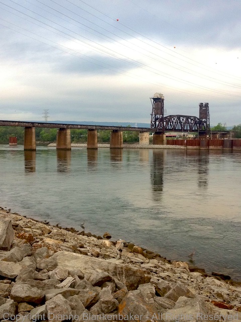
Bridge (iPhone 4S with Hipstamatic D-type film and Helga Viking lens):

Madrid Courtyard (iPhone 4S with Camera Awesome)–as a side note, this is a really bad photo that I should just delete, but it’s come in handy for lessons and it does work better symmetrically:

Now that you hopefully see that sometimes subjects just work better symmetrically, let’s take a look at a bunch of other symmetrical examples.  Unfortunately, most of these were taken with a DSLR, but I’ve noted in the captions if they are iPhone photos.  The point is that many subjects work well symmetrically.  They might also work well using other framing, but symmetry is a great rule to apply as an option.

Your Assignment:  Try cropping copies of your rule-of-thirds (or other) photos into symmetrical photos.  Can you find some subjects that work particularly well in symmetry?  Now go out and shoot.  Look for opportunities to try out this framing technique.  Hint:  using the level in Camera Awesome can help you get better symmetry, particularly when shooting architectural subjects.

Lesson 53: The Rule of Filling the Frame

One of the oft-cited quotes of famous photographers is:  “If your photos aren’t good enough, then you’re not close enough” (Robert Capa).  Given that Capa (famous for his images from wars as a photojournalist) reportedly died when he stepped on a land mine, it’s probably best to bear in mind that there is such a thing as too close.

There is an important message to consider in the context of our earlier lesson on filling the frame, however.  As I said before, your frame will be full of something.  Make sure it’s the something you wanted.  In Lesson 3, I used the example of taking a picture of my dog and how I would caption each example based on what was included in the frame and what wasn’t.

But what about when you’re shooting large landscapes?  Landscapes don’t often present themselves with logical end points.  And part of the impact of a landscape is expansiveness and scale.  There absolutely is such a thing as being too close when the story you want to tell is about vastness.  (The following examples were taken with iPhone 4S and Pro HDR app.)

You have to make choices about what will fit in your frame and what won’t when you’re shooting a landscape.  One of the things I love about landscape photography is that there is usually time to figure this out.  Granted, changing light, weather, or a rising moon may make me feel rushed, but even then, a little bit of planning gives me lots of time to choose what I want in my frame.

There are many details to consider.  One of the things I look at are the edges of my frame.  Am I cutting off a city scape smack dab in the middle of a building?  Could I change my angle slightly or take a step back to hit between two buildings instead? (The following examples were taken with iPhone 4S and Camera Awesome App.)

Similarly for a wilderness scene, I’m often shooting through tree branches.  I want those foreground branches to create a frame for the distant view.  I also want those tree branches to be in focus because I find blurry branches distracting.  Sometimes, I have to pick one, no matter how much I love pick-two menus.  (The following examples were taken with iPhone 4S and Camera Awesome app.)

Your Assignment:  You’re frame is full every time you point your camera at something.  The key is to decide what you fill it with.  Get closer when your subject warrants being close–like people or subjects where the details make the difference.  Get further away when your subject needs distance–like vast landscapes.  Then look for what else is in your frame that you didn’t pick.  Do you want it there?  Can you do something differently to exclude it if not?

Lesson 52: The Rule of Thirds Revisited

We talked about the Rule of Thirds very early on in Lesson 2.  In that lesson, we talked about framing a dog or a person and placing the intersection of the rule of thirds grid on the subject’s eye.  However, there are lots of ways to apply the rule of thirds.

Today, let’s talk about landscape scenes.  Landscapes are usually divided between sky and ground or sky and water.  To apply the rule of thirds to big sweeping scenes, you can make a simple choice:  is the scene more about the sky or the stuff below it?

If it’s about the sky, make two-thirds of the frame sky.  If it’s about what’s below it, make the sky one-third of the frame.

Here is an example of a landscape photo where I split the sky and sea about down the middle of the frame. I did this on purpose.  I wanted both rocks, the bird, and the water washing back to sea over the sand.  There was no way to apply the rule of thirds and get all of these elements into the frame the way I wanted them.  I happen to like this photo (sorry, it’s not an iPhone photo, but it makes the point).  I’ve also included two cropped versions that put the line between the sea and sky at the lower ⅓ of the frame.  In this case, I prefer to break the rule of thirds.

On the same beach, I took the following shot of a bunch of seagulls rising off the beach.  I was pretty far away when this happened, but I liked the breadth of the flock of seagulls (for all you old enough to remember, no, I’m not referring to the band).  I also like the expanse of beach underneath them with an almost equal expanse of sky.  However, I thought we should try this with the rule of thirds applied, so I cropped with ⅔ of the frame beach and another with ⅔ of the frame sky.  I think the one with ⅔ of the frame sky works rather nicely with the gulls taking off.

The next example splits the sky and land about ½ way.  This one is an iPhone photo, by the way.  I’ve cropped the photo to show ⅔ sky and again to show ⅔ land.  I prefer the one with ⅔ land in this case.  The sky is not particularly interesting or well exposed.  The land is a bit dark, but the bridge in the foreground adds more interest to my eye than the sky in the previous version.

My final example, another iPhone photo, is one where the rule of thirds was perhaps over-applied in the original photo.  The foreground rock starts at the ⅓ point on the left.  The mountains in the middle of the frame end at the ⅔ point on the right.  It’s almost too stripe-y.  I cropped this one very slightly to put the mountains at the ⅔ point on the left side of the frame.  To me, the first version confuses my eye as to which element the photo is supposed to be about.  The second version makes it obvious to me that the photo is about the river valley and surrounding mountains.  I would prefer if the barge were further in the frame, but somethings can’t be fixed.

Your Assignment:  Take a look at any landscape photos you’ve taken with a strong horizontal line.  Is that line at ⅓ or ⅔ of the frame?  If not, try cropping the photo just to see if you like it better (Snapseed provides a nice cropping tool–see Lesson 41).  Sometimes you will.  Sometimes you won’t.  Just remember that the rule of thirds can help you emphasize the part of the scene that you most want to draw the eye to.

Lesson 51: The Rule of Focus

In yesterday’s lesson, we talked about holding still.  The reason holding still is important is because of the Rule of Focus.  The Rule of Focus was once stated to me by a photography instructor as:  “If at least one thing isn’t sharp, your image will fail.”

If you’ve been following along since the beginning, you may recall that in Lesson 4, I talked about a photograph where nothing was sharp, yet it is considered by many to be among the most iconic rock and roll photos ever taken.  So, just like all other “rules,” this too can be broken.

That said, most of the time, it’s true that blurry photos don’t work.  In fact, getting sharp pictures is what drives many photographers to spend thousands of dollars on expensive lenses to get the sharpest image possible.

There are multiple parts to achieving focus.  We talked about motion blur caused by a moving camera in yesterday’s lesson.  We also talked about motion blur caused by a moving subject in Lessons 31 and 32.  Today, we’re going to talk about Depth of Field.  Now, I alluded to depth of field in Lesson 30 when we explored using a Hipstamatic lens that puts only a small portion of the photo in focus.  We also talked about depth of field in Lesson 41 when we talked about putting a human subject far from the background to increase background blur.

Today, let’s talk about some of the benefits of depth of field we get automatically when we shoot with an iPhone.  The easiest way to think of depth of field is to think of the scene you’re shooting.  The scene is 3 dimensional even though your photo has only 2 dimensions.  If you were to lay a ruler on the ground from the front of what you can see to the back of what you can see, the distance that remains in focus in your photo is called depth of field.

The point where sharpness begins is usually a bit in front of where you focused.  The point where sharpness ends is usually about ⅔ of the scene back from the point where you focused.  With the iPhone, the depth of field is far greater than with a DSLR camera with comparable settings because the sensor is so small.  This is a weirdness about depth of field–how small the sensor is affects depth of field in ways that are surprising if you don’t go into detailed, technical explanations about how light works to create images.  And, I promise, I won’t.

Here are the things that are important to remember:

  1. If you’re shooting a landscape, you generally want the photo to be sharp all the way from the front to the back.  To achieve this, try to keep objects closer than 10 feet out of the frame.  Then, select the closest object in the frame for focus.  The background will usually remain reasonably sharp.
  2. If you’re shooting a person, you generally want the person to be really sharp, especially the eyes, and you don’t care about the background–in fact, it would be better if the background were out of focus.  Focus on the person’s face or let the camera use facial recognition to achieve focus.
  3. If you’re shooting something up close, like the flowers I used in yesterday’s lesson, remember that you have to be a certain distance away to get sharp focus.  You might notice that the petals in the following photo that are closest to the camera are not sharply focused.  That’s because they were too close.  By backing away, you can get the entire bouquet in focus when you select the closest petals.

Your Assignment:  Choose a subject you’d like to have completely sharp.  Move closer and further away to determine how close you can get before the foremost part of the subject remains blurry.  Experiment with selecting different focus points to see the best place to choose focus to get the entire subject in focus.  Also try taking pictures of your favorite person to see if you can get their face sharp.  Don’t forget about the Rule of Holding Still.  If you have a landscape you can shoot, see what happens when you tilt the phone so the closest object is at least 10 feet away and you focus on that.  Try it again focusing far back in the scene and again focusing very close.  Which images have the most depth of field?  Which ones do you like best?

Lesson 50: The Rule of Holding Still

I’m not sure I previously stated this as a rule.  Since we’re reviewing the basics, I thought I would state this more directly:  hold still.  Unless, of course, you’re trying not to hold still.  But, we’ll come back to that one later.

We talked about holding the phone early on.  We also talked about different ways to prop your phone so it would be still.  And we talked about using image stabilization to help compensate for shake.

These all amount to the same rule:  hold still.

Not holding still creates blurry images.  The lower the light, the more your movement will cause blur.  If you find you consistently get slightly out-of-focus images that get worse in lower light, this probably means you were not born with the innate ability to hold an iPhone steady while taking a picture.

To show you how the amount of light available and the amount of light required to get a good exposure affects the amount of motion blur in the picture, I took 3 photos.  The first is with the flowers right under the light.  It’s pretty sharp.  The second is with the flowers a foot from the light with the exposure selected for the bright side of the flowers.  Not much difference in sharpness.  The last is the same as the second except that I asked the camera to expose the dark side of the flowers properly.  To let in more light, the camera also lets in more shake–lots of blur.

When we talked about image stabilization, I mentioned that the camera essentially waits for a moment when you’re not shaking to take the photo.  Here’s a side-by-side comparison of trying to get the dark side of the flowers exposed properly with and without image stabilization:

And here’s a second example with the flowers exposed for the well-lit portion:

If you don’t like waiting on the iPhone to decide when to take the shot (which can lead to missed moments), in the default Camera app, you can use the camera button on the screen to take a photo and create a pause between pressing the button and taking the picture by setting your finger on the button, steady yourself, and then release.  The picture is taken when you take your finger off the button.  This does not work with the volume-up button or Camera Awesome (at least not on my 4S).

I also mentioned using the headset volume-up button to take the picture as another option on the 4S or higher.  This works very well if you have a way to set your phone down, but I find it easier to press the volume-up button on the phone case than to hold the phone with one hand and use the headset when I’m hand holding.

Don’t forget about keeping your body still.  Stand with your feet wide–making a wider base will reduce sway.  If there’s a stable object you can lean against, use it.  Again, the lower the light, the more you need to worry about stabilizing yourself.  If you’re shooting in bright light, you probably won’t have motion blur problems unless you are really moving.

Your Assignment:  Try taking a photo in your house.  Indoor lighting is notoriously bad for iPhone photos.  Take a picture of something perfectly still without image stabilization turned on if you’re using the Camera Awesome app (or another app that has this feature).  Do you see blur?  Try looking at your photo on a computer screen if possible so you can tell.  Or zoom into the photo to check for blur.  Sometimes it’s too subtle to see well on the phone.

If you don’t have any blur, try less light or exposing a darker portion of the subject.  The point is to discover what level of light is required before you start having trouble holding the phone still.  Once you get to where you see a little blur, try as many of the techniques above as possible to see which works well for you to eliminate the blur.  It’s good to have several things to use for different situations as well as to combine techniques when the light is really low.

Lesson 49: The One True Rule

Coming up, we’re going to be looking at more apps and attachments and, soon I hope, I’ll be doing comparisons between the 4S and 5S.  But before we delve into more technology and gadgets, I think this is a good time to recheck on the basics.

First, let’s remember the very first lesson:  There are no rules.  I would like to amend this.  In fact, there is one true rule of photography.  That rule is that you must break all the rules if you want to take better pictures.  However, it only counts if you know you broke them.   The amazing thing that you will find (if you have not already) is that breaking a rule with purpose (even if you don’t realize it until after you’ve taken the shot) rather than out of ignorance results in a whole new level of discovery.

Sometimes, we have happy accidents.  If you ever watched “The Joy of Painting” with the ever-optimistic Bob Ross, you may recall Bob explaining that unexpected splatters of paint were really just “happy accidents” that ultimately resulted in a more interesting painting.

In photography, happy accidents are the moments when you just happen to get something amazing without really working at it too hard.  Sometimes, for example, we take a shot and something flies into the frame at just the right moment.  Sometimes we frame a subject because we like the way it looks without noticing there’s something in the frame that turns out to be the thing that makes the photo great.

Much more often, at least for me, happy accidents come in the form of imagining what we want to get, getting all setup, and then discovering that you can’t possibly get what you imagined because the background won’t work, the light isn’t right, the proportions of the things you’re shooting are different than you remembered, or some other thing that looked completely different in your mind than it does in reality and you come home with a completely different set of images than you imagined.

If you’re not imagining the images you want to create and then going out to shoot, well, don’t worry.  Most people don’t.  Most people think about their iPhone as a handy camera to pull out when an opportunity presents itself.  The thing is, not too many people get better at taking pictures that way.  Just as Bob Ross thought anyone could become a talented artist, he also thought it would take an investment of time and intention.  The same is true for photographs.  After all, good photos don’t grow on trees–not even happy little ones.  The more photos you take, the more likely you are to capture something really cool.  Even better, the more likely you are to recognize it.

Your Assignment:  I’ve placed some photos into the gallery for this post.  Can you identify which “rules” I broke in each example?  Decide if the photo works for you–do you like it?  If not, can you figure out what bothers you about it?

Lesson 48: Deciding When to Upgrade

Well, it’s that time again.  Time to decide if a new iPhone is worth the investment or not–pre-order of the iPhone 5S begins September 20th.

Deciding on new photography equipment is always a bit of a challenge.  Even if budget is not a concern, there are several downsides to switching equipment.  First, there’s the emotional attachment.  I don’t know about you, but I’m attached to my iPhone.  It feels like a friend who’s looked out for me and remained faithful in spite of many abuses.  My 4S has given me two good years and giving up on it when it still seems to be in the prime of its life feels a bit like a betrayal.

Second, anytime I upgrade, there is always a learning curve.  I really want to know if the effort will pay back in dividends with better features that make my life easier.  And, most importantly, that I won’t lose some of the features I’ve come to rely on the most.

Finally, there’s the inevitable domino effect of a new device:  a new case, a new lifejacket, a new bike mount, and, of course, what about all my nifty lens attachments?  Is upgrading to the latest gadget worth the inevitable headaches of replacing all the stuff I’ve accumulated for the current version?

I’ll jump to the end of the story:  I have decided to order the 5S.  But, I don’t take the decision lightly.  If you are considering whether it’s time for an upgrade or not, here are the things that tipped the balance for me:

  1. The fingerprint security.  One of the most painful things about my 4S is having to type in a lengthy, complicated password to unlock it.  Now, not everyone has to have a long, complicated password, so this may not be an issue for you, but the thought of being able to unlock my iPhone by simply placing my finger on the home button means not having to choose between missing a moment and using default camera app.
  2. A faster, brighter camera with a bigger sensor.  I have struggled with night time and low-light photos with my 4S.  Having a bigger sensor should help reduce noise and make it easier to get those low-light photos that I’ve been missing.  If you’re not frustrated by what you get with your current iPhone, this also may not matter to you.
  3. A new processor that will allow the camera to focus faster, capture photos faster, and, presumably, faster photo processing.  This equates to fewer lost moments and less time spent editing.
  4. A co-processor that does smart things to save your battery.  Battery life is another struggle when out and about and doing a lot of shooting.  A dead battery means more missed moments.
  5. 10 frames per second burst mode.  That’s pretty impressive.  It means being able to take a series of photos that are firing off 1/10th of a second apart.  More potential to capture more moments.
  6. An improved flash.  While the flash doesn’t claim to be brighter, it’s supposed to create better color temperature and light the scene better.
  7. iPhoto available at no charge.  iPhoto has some nice organization features and, I hope, will allow for metadata management on the iPhone–something else I’ve missed.

That’s my list of iPhonography related reasons (aka, excuses) for why I’ve decided to order one.  To alleviate my guilt, I’ll be donating my 4S to my husband, who is still using a 3G S iPhone–that way, my 4S will still be part of the family.

Your Assignment:  What are your criteria for how you decide when it’s time to upgrade?

Lesson 47: Blooming Snapseed

Today, I randomly chose a photo and edited it in Snapseed to demonstrate 3 things:

  1. Using some of the tools in Snapseed we haven’t used in earlier lessons
  2. You can edit yourself in circles
  3. Editing doesn’t necessarily make a photo better.

Here is the original photo next to my resulting photo after editing:

In the process, I used the Grunge, Vintage, Details, Retrolux, Drama, and Tune Image tools.  There are several reasons why it probably isn’t a good idea to use this many editing tools on one photo.

First, while there are several claims on the web that Snapseed is “non-destructive,” meaning the resolution of your photo is not compromised by the editing process, I am not convinced.  It’s very difficult to tell what is photo degradation vs editing effects both visually and from a file size perspective.  I tried saving each version of the photo between steps and found that the file size got progressively smaller until I added a texture and then the file size increased.  So, I am going with the assumption that data loss from the original image occurs each time you apply an editing tool, although some editing tools apply extra data.

Second, Applying edits in different orders creates different results.  Working from left to right applying the same edits created a very different photo.  Here are the two different edits side-by-side:

Some edits seem to “undo” previous edits by applying, for example, a different texture to the photo.  In the end, there are a nearly infinite ways in which you can change the photo.  But, the question is:  should you change the photo?

In this case, the main issue with the original photo is that the focus is behind some of the unopened petals in the center.  Neither edit fixed this problem.  If I wanted to improve the photo, I would try sharpening it to see if I could get the center petals in focus.  Interestingly, one of my interim edits did result in a sharper image than the original:

I would still prefer to have had the original photo with the focus I wanted.  Focus is one of the things it’s hard to fix after the fact.

Your Assignment:  Pick a photo that maybe isn’t so interesting.  Open it in Snapseed and try the various tools.  For the steps I took editing the photos, refer to the instructions below.  Try the different tools in Snapseed in different orders to see which order seems to work best for you.  Here are the instructions for the first edit:

Lesson 46: Flower Power

For today’s lesson, I used Hipstamatic with the Helga Viking Lens and the Black Keys film.  What I’d like to focus on (sorry for the pun) is something called depth of field.  Now, if you’ve read my About page, you know that I’m not allowed to explain technical stuff in this blog.  I’m going to try to keep this as simple as possible:  depth of field is what we call the distance from front to back of the scene that is in focus.  Now that I’ve said that, I’ll warn you that that’s not entirely accurate, but let’s just leave it at that before I get into trouble with Gina.

When we looked at taking portraits in Lesson 41, we talked about wanting to keep some things in focus and other things not in focus.  That’s what depth of field is all about–how do you get what you want in focus without getting other stuff in focus?

One of the painful things about the iPhone (or any other smartphone camera) is that you have very little control over this whole Depth of Field thingy.  But let’s look at what happens when I use Hipstamatic to take some very close-up photos of flowers.

In the first photo, I was so close to the group of bright yellow flowers, the reflection off of them creates a haze around the blooms.  Part of the haze is caused by soft focus on all but one flower hiding in the shadows.  While I usually like sharp photos, there is something about this hazy effect that appeals to me.

In the second photo, the leaf in the foreground is what’s in focus.  The softer focus in the other leaves and the background fence cause the leaf and fence patterns to start to look a lot like each other.  Again, while I would normally consider this a failure because of the limited focus, there’s something appealing about this to me when combined with the Hipstamatic effects.

In the third photo, the blades of grass are very sharp in the foreground, but only a few of them.  The rest blend into a mass of haze.  I’m still trying to decide if I like this or not, but it’s a good demonstration of what we would call a shallow depth of focus–only an area a couple of inches deep in the scene is in focus.

The fourth photo really brings this effect home.  The small, tall flowers in front are sharp while the big flowers in the background are soft.  I want to love this photo, but I would love it more if the foreground flowers were lighter and stood out more.  The background flowers would create a nice backdrop if there were more contrast between the background and foreground.

The fifth photo breaks one of the rules of photography.  That is, don’t have stuff in the foreground that’s out of focus.  Notice the big white flower completely blurred in the lower right.  I like this photo anyway.

Finally, my favorite, the sixth photo focuses sharply on an unopened bud with a large bloom out-of-focus in the background.  I would prefer this photo in a rectangle so that the little leaves around the bud weren’t cutoff, but I like that it’s less expected for the focus to be on the unopened bud than on the fully opened flower.

In all of these examples, I had only one way to control what was in focus and what wasn’t–distance to the subject.  By getting too close to some subjects, they were out-of-focus (like in photos 1 and 5).  Or, by getting just far enough away to focus sharply on the thing that was closest, I left the background out of focus like in photos 2, 3, 4, and 6.

Your Assignment:  See what happens when you get very close to a subject.  Pick a flower garden and shoot away.  Can you get the subject in focus?  How many other things are in focus?  Can you get closer?  When do you start to have problems getting the closest object in focus?  Do you notice how far away the background objects need to be before they fall out of focus?  Which do you prefer:  out-of-focus foreground objects or out-of-focus background objects?

Lesson 45: Post Processing or Photo Manipulation?

In Lesson 40, we took a badly lit photo of my dog sitting on my husband and did some basic editing to shift the attention from the bright background to my intended subjects using Snapseed.  These are the original and post-processed versions side-by-side:

I mentioned in Lesson 40 that post-processing is usually considered the digital equivalent of developing film.  However, you can also do an extreme amount of editing and end up with something that doesn’t look like a photo at all.  This is usually called digital manipulation or graphic art, but when editing crosses from post-processing to “manipulation” is largely subjective and hotly debated.

Since it really doesn’t matter what you call it, we’re not going to argue about it.  I’m just going to show you an example of more extreme editing that produces a completely different look from what I actually saw when I took the photo.

I used Snapseed to do a similar editing process as in Lesson 40, but I took my changes to the extreme.  I also used heavy sharpening to create an effect that makes my husband and dog look more like a drawing than a photo.

Here are the steps I used in this edit.  Note that there is a clever tip included on copying and pasting selective adjustments that comes in very handy.

Let’s look at the original photo, the previsously post-processed version, and today’s extreme edit side-by-side:

Personally, I am a bit of a traditionalist.  I like photos to look like photos or to not at all look like photos.  More abstract subjects work for me in extreme editing modes, but I am not fond of this look for human or animal subjects.  Maybe someday it will wear me down and I’ll start to like it–in the meantime, I always think of images of Elvis on black velvet when I do these types of edits.  🙂

Your Assignment:  Start with a photo that has something a bit off in it like a too-bright background and poorly lit subject.  See if you can use this series of edits (and/or throw in some of your own) to create something that looks really cool.  Or, perhaps, makes you, too, think of Elvis on black velvet.  Do you like this look?  It’s OK if you do.  🙂  That’s the important point–discovering what is possible and what appeals to you.