Lesson 77: Paper Camera

Today, I want to introduce another app.  This one is called Paper Camera.  It’s $1.99 and it’s available for both iPhone and Android phones.

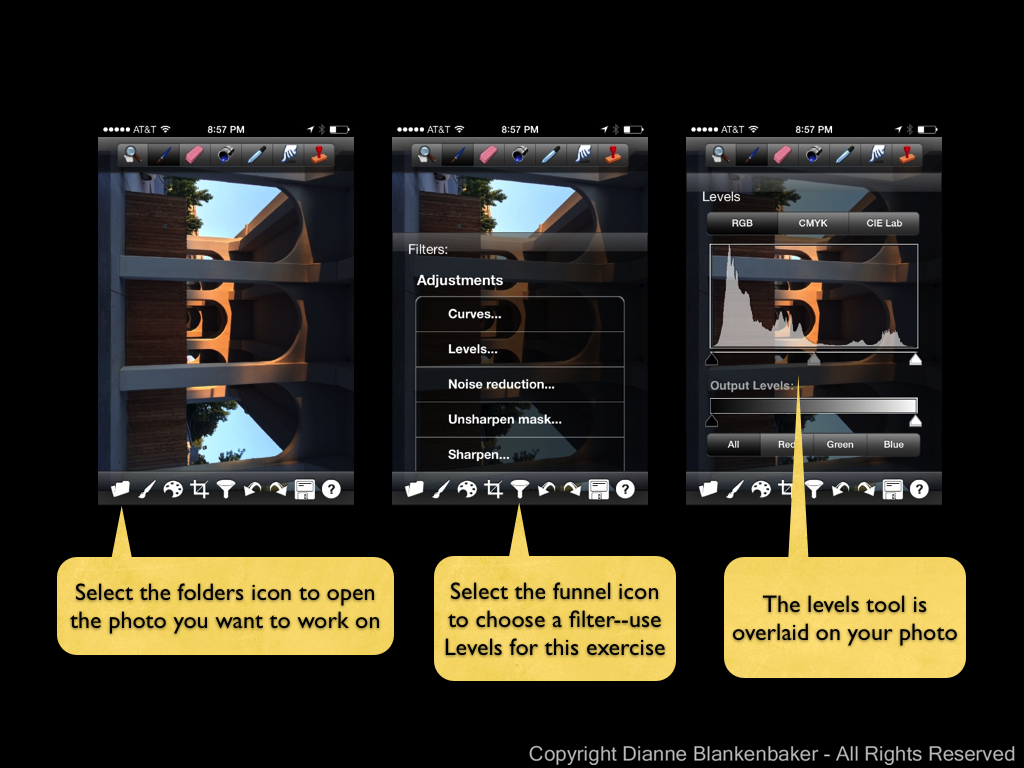
I found this app while looking for an app that has the same levels adjustment PhotoForge has (see Lesson 76)–I still haven’t found one yet, so let me know if you have one!  I downloaded it out of curiosity, played with it a few minutes and then forgot about it.

Then, I was working on creating a graphic for a small business.  I’m not a graphics artist, so I was starting with a photo and doing all kinds of crazy things in Photoshop Elements trying to turn the photo into something that would work.  After spending hours shooting and editing, I realized I didn’t have the right composition to make the image work.

I packed up my tripod, camera, light stand, light modifiers, flash, and various accessories and headed back to the client’s location to shoot again.  I got there (feeling like a pack mule) and suddenly remembered the Paper Camera app.  I pulled it out, and with a single tap on the screen, created a graphic that will work.  I immediately got depressed.

But, you should rejoice!  This little app will allow you to create really funky stuff when you’re feeling like having a little fun.  What’s also exciting is that it will create the same effects in video.  And, you can see the effects in your screen as you’re taking the photo/video.  It’s pretty wild.

There are three things I don’t like about the app:

  1. It doesn’t save an unedited version of the photo–you only get the image with effects applied.
  2. It’s upside down, doesn’t rotate, and the volume-up button doesn’t work for shutter release.  I guess this could be 3 things, but it’s the combination of them that I find annoying.
  3. While the icons in the app are cute, if you’re someone who needs reading glasses but tries to get by without them, it’s hard to tell what they are.

That said, it’s still a lot of fun to see the world in line drawings or cartoon live on  your phone.

Your Assignment:  If you’re interested in this app, download it and try out the various effects.  Try flipping over to video with the “Con Tours” effect on.  It’s fun.  Here are screen shots of the different effects.  I’ll do some more details on what you can do with this app in later lessons.

Lesson 76: PhotoForge Levels

I previously promised I would talk about PhotoForge as an editing tool.  After I put together steps for a simple adjustment that can be made using PhotoForge (see below), I did a little googling so I could tell you how much PhotoForge costs.  Unfortunately, I discovered I apparently missed the news bulletin that PhotoForge’s development company was acquired by Yahoo in June and the app was removed from the App Store.

So, if you don’t already have PhotoForge, this lesson will not apply for you.  Sorry about that.  I guess this will be the one and only lesson on PhotoForge!

The adjustment I love the most in PhotoForge is available in a variety of editing tools (I’ll find another iPhone app for this in a future lesson).  I use it on nearly every photo I take, iPhone or DSLR.  It’s the levels adjustment.

“Levels” refers, to put it simply, to how bright or dark the tones are in a photo.  The “tones” are grouped into shadows, mid-tones, and highlights.  The left-most slider adjusts the darkest parts of the photo, the middle affects the mid-tones, and the right-most slider adjusts the highlights.  This allows you to, more-or-less, selectively change the exposure.  It gives you far better control than, say, the brightness adjustment in Snapseed.

For this example, I chose a photo that was an OK photo, but needed some punch.  Follow the steps below if you have PhotoForge to play along at home.

Your Assignment:  Try a levels adjustment in PhotoForge (if you already have the app).  Here are the steps:

20131013 PhotoForge Levels.001 20131013 PhotoForge Levels.002

Lesson 75: HDR Adjusted

Since we’ve been on the topic of HDR for a few lessons now, one thing I wanted to mention was that even when you used HDR photography, you can still gain more control over the end result of your image by doing post-processing.

Now, as you know by now, I love Pro HDR for iPhone HDR photos.  Pro HDR has several adjustments you can make before you save the image.  You can see details about those adjustments in Lesson xx.  However, that’s not quite the same as post-processing.  After you’ve saved the image, you still may want to apply some adjustments to make the photo look the way you want.

For example, let’s say I thought my sunrise HDR photo from the iPhone 5S from the Sunrise showdown was too dark.  I could use adjustments in Snapseed to brighten up the image.  That is, I could if my iPhone screen weren’t currently broken and I could see to edit on my iPhone!  🙂  Sorry, I had to cheat one last time and edit in Aperture.  But, my replacement phone is on its way!

So, imagine this was edited in Snapseed:

I tend to be fond of darker images with strong contrasts, so I’m not particularly enamored with this edit.  However, I often find that when I see my photos later, they look too dark to me, so maybe tomorrow I’ll like the brighter one better.

Your Assignment:  Take a photo that your pretty happy with.  Do just a few adjustments on it like brightness and contrast.  For details on how to use Snapseed, check out Lesson 41, 45, and 46.  Are there certain adjustments that seem to really help your image?

Lesson 74: The Range of HDR

In yesterday’s post, I mentioned that some HDR processing takes the image to the point that it no longer looks like a photograph.  To give you an idea of the range of HDR-type processing possible, I did several different versions of HDR images using 5 photos taken with my DSLR at different exposures and combining them using Photomatix, a software tool used on a desk/laptop to combine exposures.

I realize this is cheating since this blog is about iPhonography and not about DSLR photography, but I thought it was worth the cheat just to give you an idea of the kinds of looks people may be thinking of when someone says “I don’t like HDR.”

Here is the range of looks I created for examples:

I do not have scientific data on how people respond to these different types of looks.  However, the anecdotal evidence I have is that people do not notice the HDR effect in the more subtle examples at the left; they just think it’s a “regular” photo.  As the photo moves from looking like a photograph to looking like a painting to looking like a painting gone horribly wrong, my experience has been that most people really like the painting look the first time they see it.  They like it the second time they see it.  They might even go a little nuts over it.  Then, at some point, they start to think it looks, well, to borrow a term from my husband, “kitschy.”

Of course, there are no rules, and I have seen this look applied artistically.

For example, I really like the work of a fellow blogger and iPhoneographer extraordinaire, Davide Capponi.  Davide does extraordinary things with iPhoneography by using multiple editing apps to create something that transcends photography.  Here is an example of one of his images that started with Pro HDR.  If you peruse Davide’s work, you will find that few of his images look like photos, yet I can’t imagine anyone calling them kitschy.

To me, the difference between “kitsch” and art is hard to define.  To a certain extent, when you see the exact same look produced over and over again by many different people, it starts to look kitschy.  When you see something that is truly unique, it stands alone.

Your Assignment:  Are you interested in just taking pleasing photographs with your iPhone, or does the thought of using it as a medium to create unique art excite you?  If you fall into the latter category, I suggest you spend some time looking at Davide’s work.  Davide records what apps he used for taking the photo and for editing.  You’ll notice he often uses a combination of 4+ apps to create his final image.  Do you find yourself inspired?

Lesson 73: The Rule of HDR

HDR photography has continued to grow in popularity–more and more cameras have built-in HDR processing. However, High Dynamic Range photography comes in a wide array of styles.  The HDR styles that result in images that no longer resemble photographs failed to catch on in the photographic circles I run in.  At the same time, there seems to be a growing appreciation for what can be accomplished subtly with HDR technology.

In case you are just jumping into this conversation, Lesson 9 was when we first introduced HDR and there have been several lessons that talk about it since, including yesterday’s lesson.

As far as achieving subtlety in HDR photos, the iPhone 4S and 5S excel.  While it’s possible I just need new glasses, it’s a little too subtle for me.  The Pro HDR app results in more oomph than either of the built-in apps, although sometimes it’s a little more oomph than I want.

Revisiting the examples we used in the previous post, let’s take a look at what Pro HDR was able to achieve in both the 4S and 5S versions:

Now let’s look at the 4S Apple Camera App with HDR next to Pro HDR:

And, of course, the 5S Apple Camera App with HDR next to Pro HDR:

Your Assignment:

Take a close look at the above images.  Which look do you prefer?  If you’ve downloaded the Pro HDR app, try experimenting with your own photo to see if using the adjustments in the app allows you to get a range of looks that give you more flexibility than the Apple Camera app.

Lesson 72: 4S-5S HDR Showdown

While I was out shooting the sunrise yesterday, I also decided to give the 4S and 5S a test drive with their HDR setting.  As we discussed in Lesson 9, HDR stands for High Dynamic Range and is achieved by combining multiple images with different exposures into a single image, using the best exposure for each part of the image.  As I also mentioned, I did not have much success with the 4S Apple Camera app’s version of HDR.  One of the things I was hoping to see in the 5S was an improvement in the capture of details in bright and dark areas using the Apple Camera app with HDR.

That said, let’s compare the 4S to the 5S with the HDR on:

The major difference between the two (and I spent some time looking at these side-by-side at 200% magnification) is in the light areas around the sun.  Surprisingly, it’s the 4S that has more details in the clouds surrounding the sun, all the way down to the water.  On the flip side, the 4S produced an oddly shaped sun and the color in the sky looks mostly gray while the 5S seems to have smoothed out the sun a bit and captured more blues in the sky.

The bottom line:  if you’re thinking about upgrading to the 5S purely for improved HDR photos, you’ll probably be disappointed.

For grins, one more comparison–yesterday’s photos without HDR next to today’s photos with HDR:

Your Assignment:  If you haven’t checked out the Pro HDR app yet, review Lesson 9.  Tomorrow, we’ll talk more about HDR.

Lesson 71: 4S-5S Face-off at Sunrise

The iPhone 5S promises better photos.  It has a bigger opening in the lens for light to come through to allow for better low-light images.  It has a bigger sensor with larger pixels promising more light will reach each pixel and there will be less noise in your pictures.  What does all that mean?  We can see more details in the light and dark areas of photos, we can take better pictures in low-light conditions, and we can expect fewer annoying speckles in our photos.

Now for the test.  While out walking my dog this morning, I happened to be in time to see the sun rising over the Tennessee River just under a low-lying covering of clouds that were in the process of being swept away by the wind.  For once, I was packing both guns with my 4S in my left back pocket and my 5S in my right.

I literally took a point-and-shoot shot with each phone.  I used the default camera app with HDR off for this comparison–I didn’t even tap the screen to set focus or exposure.  I just help up each phone and shot.  Neither photo has had any post-processing done to it.  Drum roll please . . .

This is a a test of extremes.  The sun presents an extremely bright area while the water and bridges provide some very dark areas.  This is the kind of scene that challenges even the most sophisticated cameras.  Can you tell the difference between the way the 4S and the 5S each handle the subject?  Look closely at the sun.  Notice how the 4S version is a bigger blob with less detail in the clouds immediately around the sun.  Additionally, the big bridge support that’s nearly centered is slightly better exposed and shows more detail as well (this may be hard to see without magnifying the full-resolution photo).

Overall, the iPhone 5S also renders the golden light in the photo better–particularly where it is reflected on the water.

So, in short, I’m happy to see there is a visible difference between the two iPhones, but maybe that’s because I just bought the 5S and I’d really like to feel justified in making that decision.  If the difference is so minuscule to you that you can’t see a difference, well, hold the phone . . . we’ll take a look at more comparisons in other lighting conditions to see how the 5S fares.

Your Assignment:  No homework today!


Lesson 70: The Rule of Post-Processing

I mentioned in Lesson 40 that post-processing is the stuff you do to your photo after you take it to make it look the way you want.  Something we don’t always remember is that back when photos were taken using film, part of how a photo turned out was determined by the mysterious person who developed that film and printed our photos.  Unless you had a dark room, you didn’t have any control over how those final steps were performed, yet there is a considerable amount that can be altered in the developing and printing process.

Since that’s about all I know about developing film, let’s talk about how this translates into “developing” digital images.  Back in Lesson 40, I also mentioned that the iPhone (or whatever camera you’re using) makes a lot of decisions for you about how much to saturate the colors, how bright to make the image, how to balance the whites, etc.  For you to have control over what that final photo looks like, you need to change those decisions to your liking.

What you should not do is spend a lot of time trying to fix things that can’t be fixed.  So here are some of the things not to waste your time on:

  1. Focus.  If the focus is very slightly soft, you might be able to sharpen it slightly.  In most cases, it will still make your eyes cross and the photo will look “crunchy” (to borrow a term from photographer John Greengo).
  2. Bright spots that are completely and totally white.  There’s no getting that data back in JPEG photos (which is what you get with smart phones).  If the photo is still tolerable with those blown-out areas, keep it.  If not, toss it.
  3. Dark spots that are completely and totally black.  Just like #2, there’s no getting that data back.  It’s called “clipping” when the camera can’t record the details in dark areas and just records solid black.  Once again, decide if you can live with it or toss the photo.

Proving I am a hypocrite, I was able to find an example photo that contains all three of these problems (yet, I did post-processing on it and tried to save it anyway):

IMG_2809 - Version 3
Blown-out white around the left eye, clipped black in the black on his side, and definitely not sharp!

What can I say–I really love my dog, it’s hard to toss photos of him no matter how bad they are.

We’ve been using Snapseed for editing so far in this series of lessons, but there are other options.  In fact, there are over 2000 photo editing apps in the Apple App Store.  Plus, many of the camera apps (including the iOS 7 Apple Camera app) also have some level of editing capability.  Before you get too crazy looking at different photo editing capabilities, just take it one step at a time.

Your Assignment:

  1. When you take a photo that you thought was going to be really cool, but it’s not quite what you wanted, try the adjustments available in the camera app you’re using to see if you can get what you wanted.
  2. If you can’t, that might be a good time to invest some time using Snapseed.  It’s pretty intuitive once you get through one or two edits and there are plenty of lessons to help you along in this blog (do a search on Snapseed from the iPhonography Lessons page).
  3. As you start getting comfortable with a few adjustments, you’ll find yourself wanting to use them more and more often.  You’ll start recognizing when a photo needs a contrast boost, for example.  Post-processing will become a quick and easy workflow you can apply to the photos you want to keep.
  4. When you have something your really can’t get what you want out of, it might be time to investigate what other photo editing tools are available and what you might be able to do with them.  I’ll be doing some lessons on PhotoForge in the near future.

Lesson 69: The Rule of Protecting Your Gear

In Lesson 19, we talked about cleaning the iPhone lens and your case to make sure you get the clearest photos possible.  In that lesson, I showed the LifeProof case I use with my iPhone 4S, which effectively protected my iPhone 4S from drops, dunks in the river, and miscellaneous abuses for 2 years.

Unfortunately, the new LifeProof case for the iPhone 5S is not yet available.  Instead of buying a case to use temporarily, I thought I could wait it out for the LifeProof case.  As it turned out, I was wrong.  I did one of those moves where I pulled my phone out of my back pocket, lost my grip on it, juggled it back and forth for at least three passes in a desperate attempt to save it, and then it landed face-down on rough pavers, shattering the screen.  The good news is that the camera still works.  The bad news is that I keep getting splinters of glass in my finger tips when I try to use it.

So, for those of you planning to upgrade your iPhone, I thought I would share something I fortunately learned before I ordered my 5S:  AppleCare+, the extra warranty you can purchase with your iPhone (and other Apple products)–now includes coverage for 2 accidental damage incidents in 2 years.  There is a fee for the repair/replacement, but just one breakage more than makes up for the cost of the protection plan and the fee.  Supposedly, they started this when the 4S was introduced, but when I bought my 4S, I was told AppleCare+ did not include accidental damage.  Oh well.

So, to recap, get a case.  Preferably one that will help prevent screen breakage, but some protection is better than no protection.  Second, consider buying AppleCare+ when you get a new phone.  Finally, take juggling lessons.

Your Assignment:  Assess your current damage risk.  Have you dropped your phone and not gotten it repaired?  Is there a risk that your camera will not work when you need it?  Are you upgrading soon?  Consider your own history of accidents.  Are you good at protecting your iPhone?  Are there others in your life who use your iPhone who might not be so good at keeping it safe?  Consider whether you need to upgrade your current case even if you aren’t upgrading your phone.


Lesson 68: Panoramic Upgrade

One of the features of the new iPhone 5S that contributed to my decision to upgrade was the enhanced exposure while taking panoramic photos.  Panoramic photos are just plain fun.  They give you the option of capturing a scene that is far wider than your lens.  And, they let you bend reality into a half circle.

The problem with the iPhone 5S predecessors that support panoramic photos is that the exposure is set by the brightness of the area where you start your photo and then the same exposure is applied throughout the entire shot, even if the brightness of the scene changes dramatically by the time you get to the end of the shot.  This results in images like this one, taken using the iPhone 4S:

Notice how my husband and dog in front of the stone building (all in the shade) are properly exposed, but everything in the bright sun is overexposed.

What changed in the iPhone 5S is that the exposure now adjusts as you move through the process of capturing a panoramic.  The actual steps to capture a panoramic haven’t changed significantly–the only difference is that you now swipe to change modes from “regular” photos to panoramic (or square or video).  For detailed instructions on how to create a panoramic with an iPhone 4S, see Lesson 27.

The fact that the exposure now adjusts allows for panoramic photos with dramatic differences in brightness from beginning to end like this one, shot with the iPhone 5S:

Notice how even with the sun in one side of the image, the exposure is pretty decent throughout.  Of course, this isn’t quite a fair comparison–the 4S example was shot in the middle of the day.

If you’re shooting with a predecessor to the iPhone 5S, you’re best option is to try to start your panoramic in a part of the scene that is about halfway between the darkest and brightest areas of the scene, even if it means you have to crop part of the image away later.

Your Assignment:  Experiment with Panoramic photos.  What kinds of settings work best as panoramic images?  How far away do you have to be from the objects in the scene to avoid bending them into a giant U?  Can you find a way to get a decent exposure with a predecessor to the iPhone 5S?